EN / 中文

Eleme Data Analytics.

ELEME data analysis information
ROLE
Solo UX/UI Designer
PLATFORM
Eleme Retail Merchant Portal
PROJECT TYPE
Multi-module Design
TIMEFRAME
5 Months

TOOLS

CONTRIBUTIONS

  • 💡 Discover pain points in using the merchant data analysis module through product walkthorugh, merchant interview, and competitive analysis.
  • 💡 Independently responsible for the interaction and visual redesign of all modules to improve the smoothness and consistency of product experience
About Eleme Data Analytics Redesign 📈
UX/UI Design

Eleme is one of the largest food delivery platforms in China. Its retail business mainly covers home delivery services in categories such as supermarkets, flowers and aquatic products, and medical services. The data analysis module provides merchants with tracking of operations, traffic, services, products, promotions, markets, and customer-related data, and helps merchants formulate business strategies. User pain points are addressed through conducting various research methods. From that, comprehensive upgrades of all sections in this module are carried out and finally improve the CES score and reduce merchants' understanding effort and number of problem tickets received.

Project process.

design process

How does the data analysis module work on the platform?

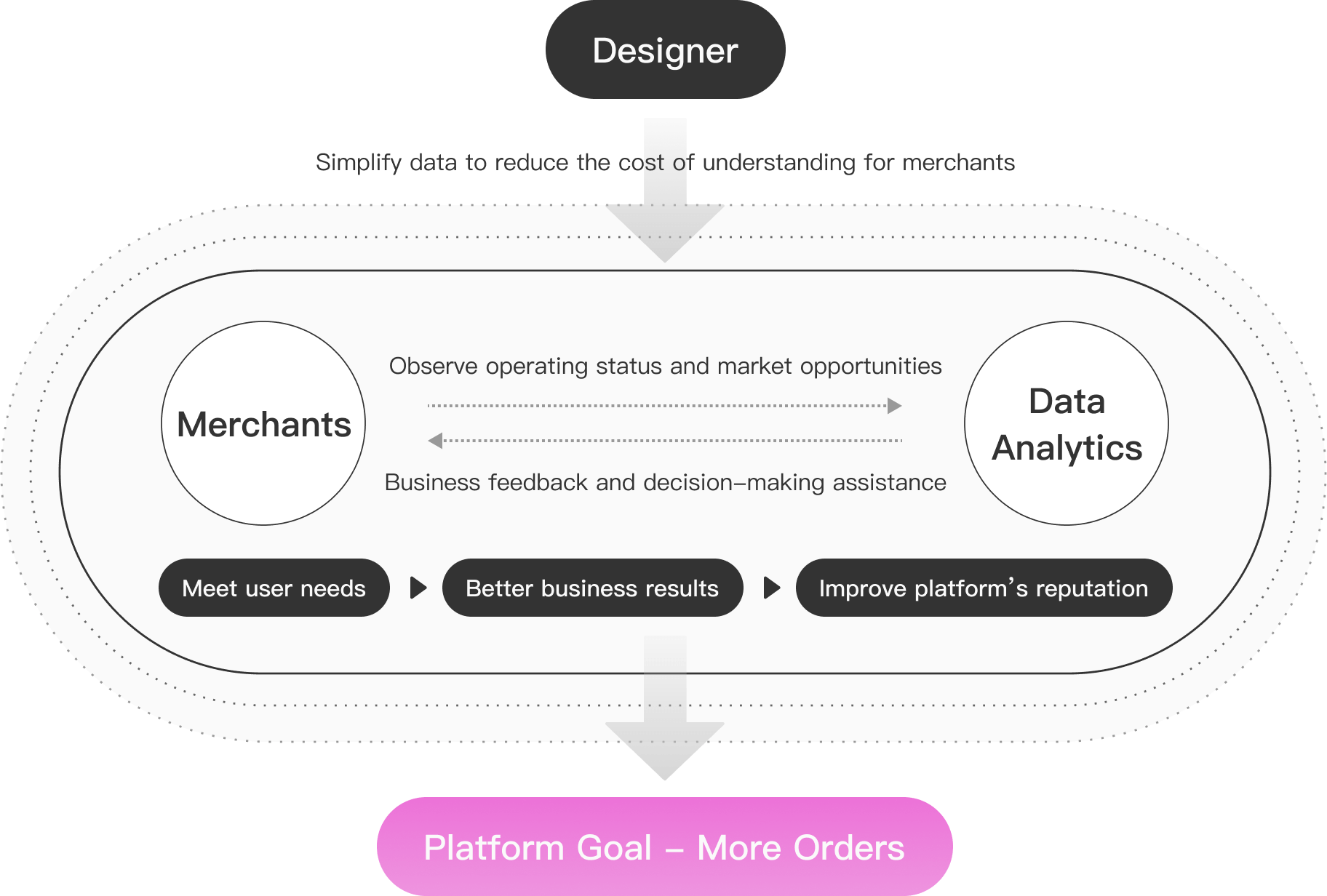
The data analysis module provides merchants with a channel to understand their own business conditions and surrounding market opportunities, helping merchants obtain better operating results, thereby indirectly increasing merchants' retention on the platform, and ultimately achieving improvement in platform reputation and business growth.
Because of the education background of target users is limited, an UX designer, in this case, plays a role in simplifying the skin of complex data, helping merchants understand and analyze data at low cost through design means, so as to maximize the matching between the product and user needs.

business-undertaking

Quick overview of pages before redesign.

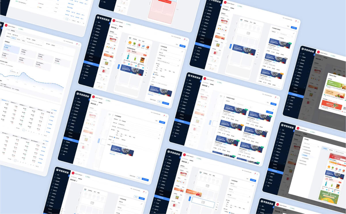
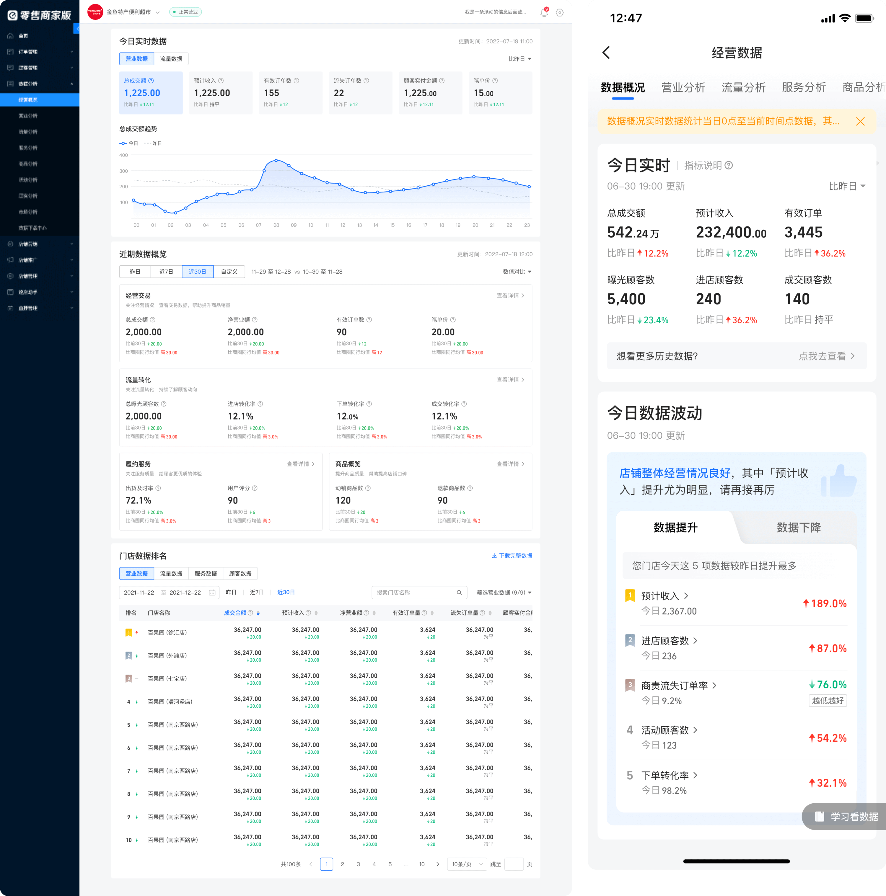
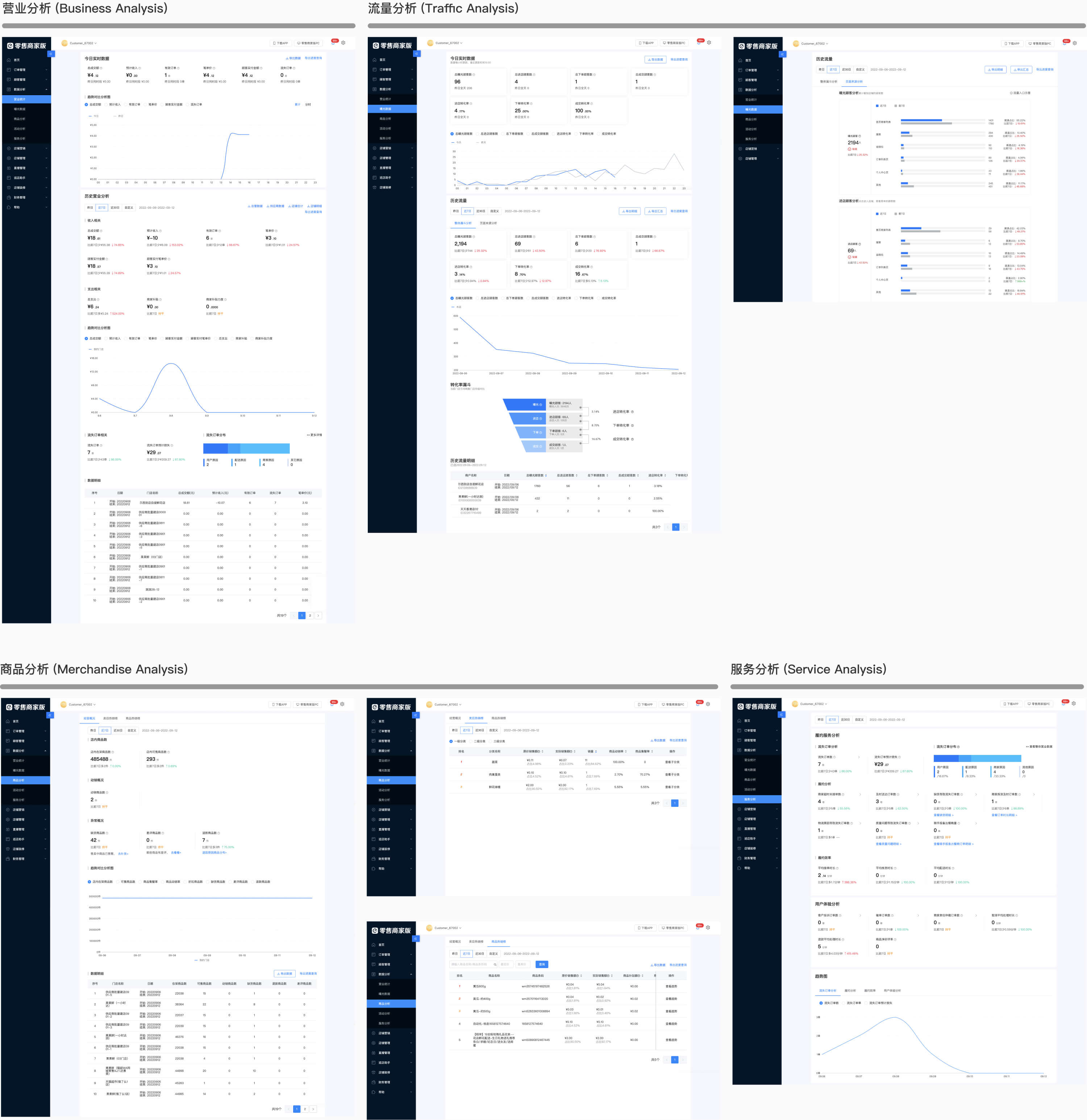
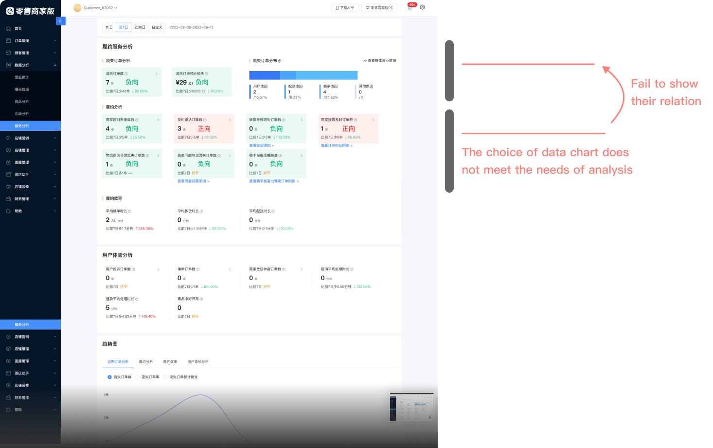
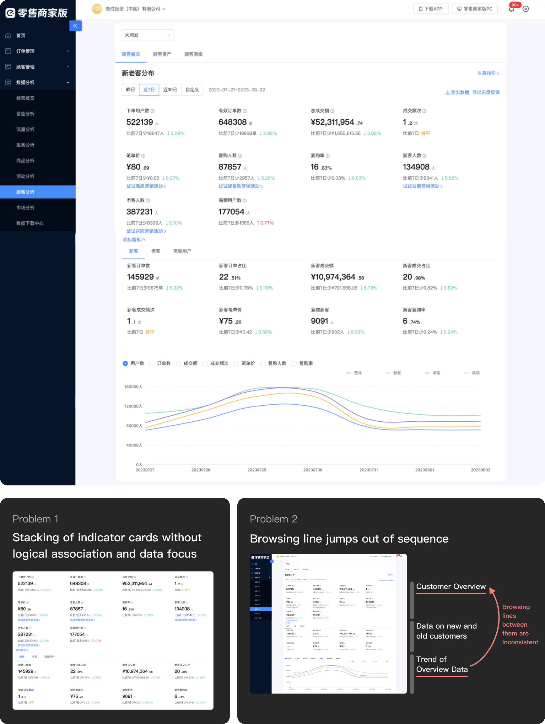
Taking the PC-side page as an example, there are overall problems such as lack of module functionalities, chaotic page layout, and lack of design consistency.

pages before redesign

Let's digger deeper into current issues.

User Interview
Product Walkthrough
Competitive Analysis
🚩 Goal
  • 1. Learn user's operating capabilities and dependence on the data
  • 2. Understand user's understandability, such as whether charts are understandable
  • 3. Understand user needs and behavior patterns, including what to read and how to read it
📔 Proposal

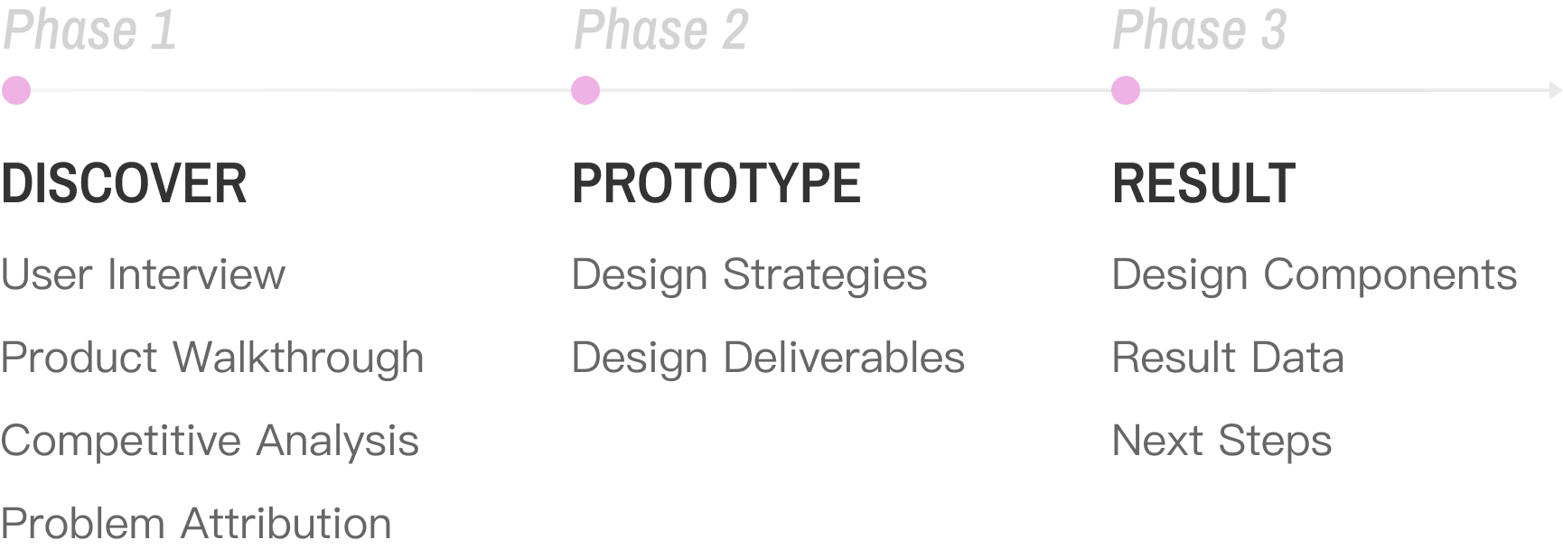
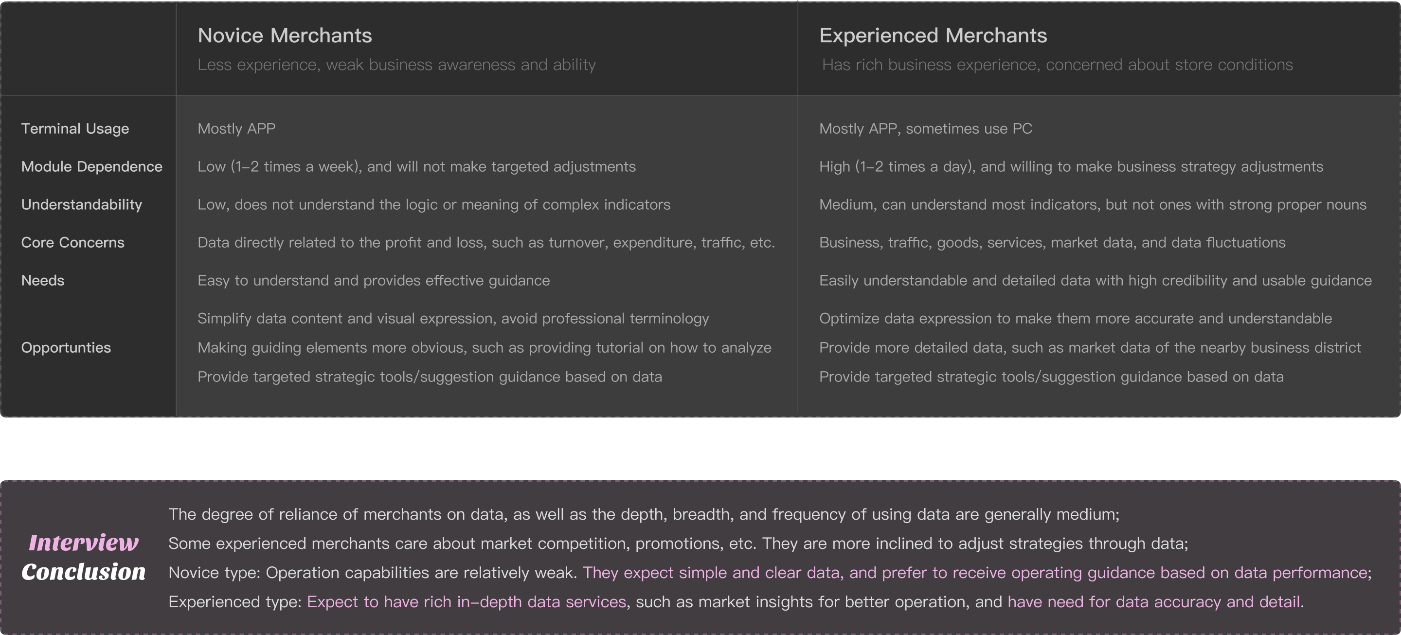
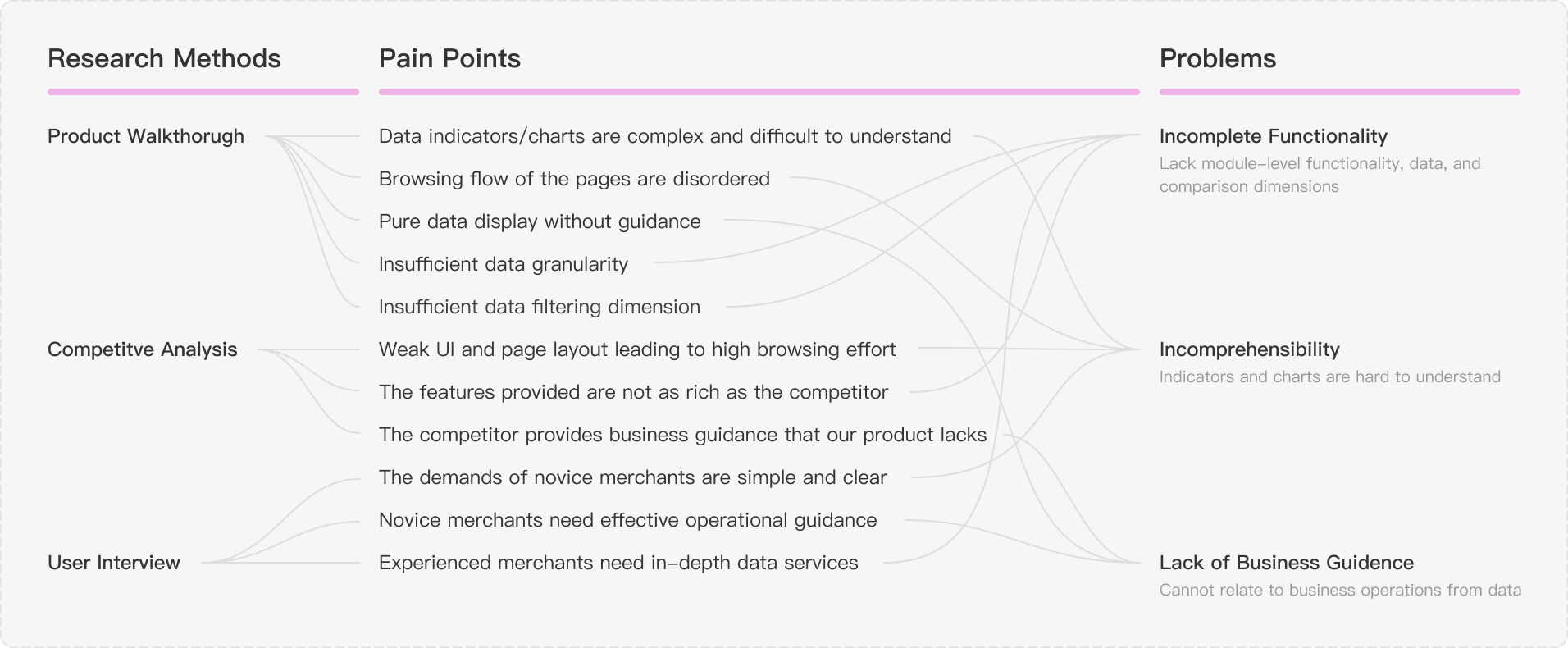
The overall idea is "Learn their background and business intention -> Learn their dependence on data analysis -> Learn their usage preferences and pain points -> Learn their data needs in each section".

👤 Interviewees

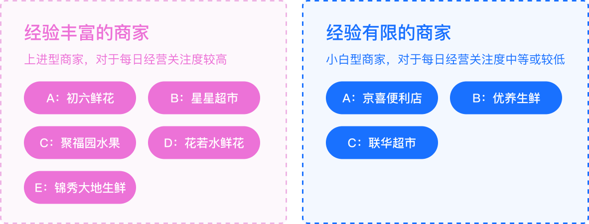
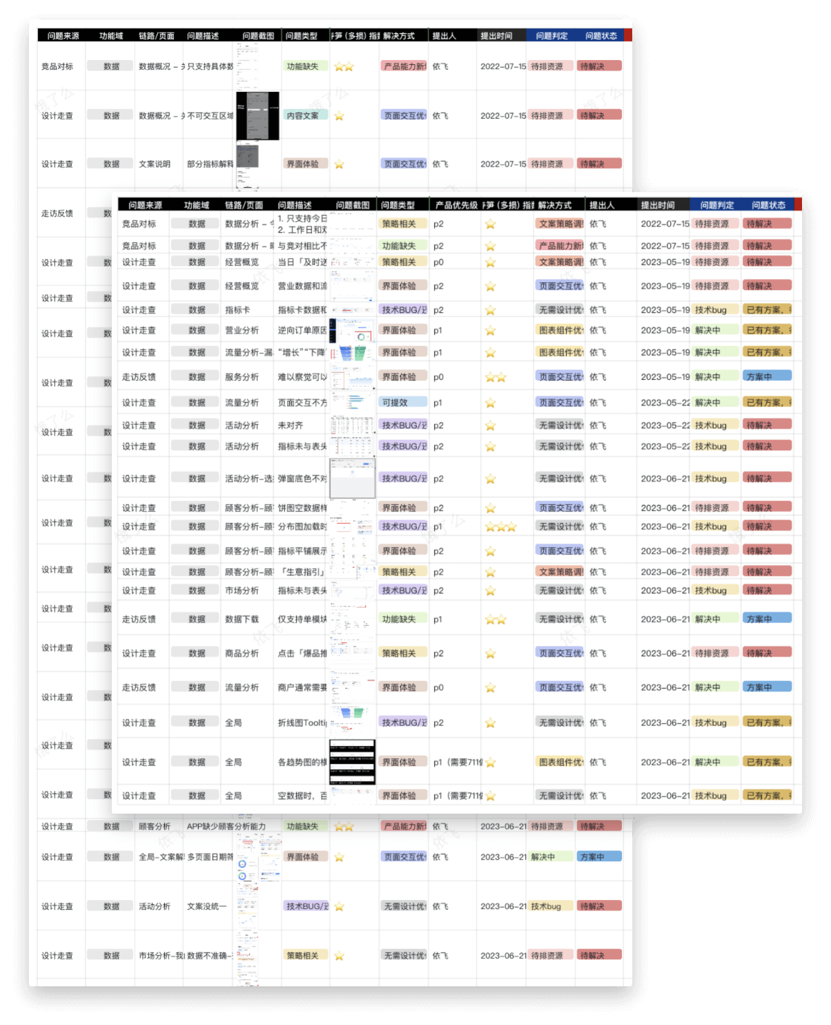
I have interviewed 8 merchants, including 5 experienced and 3 novice ones (User stratification is from past data).

interview user
💡 Conclusion

interview insight

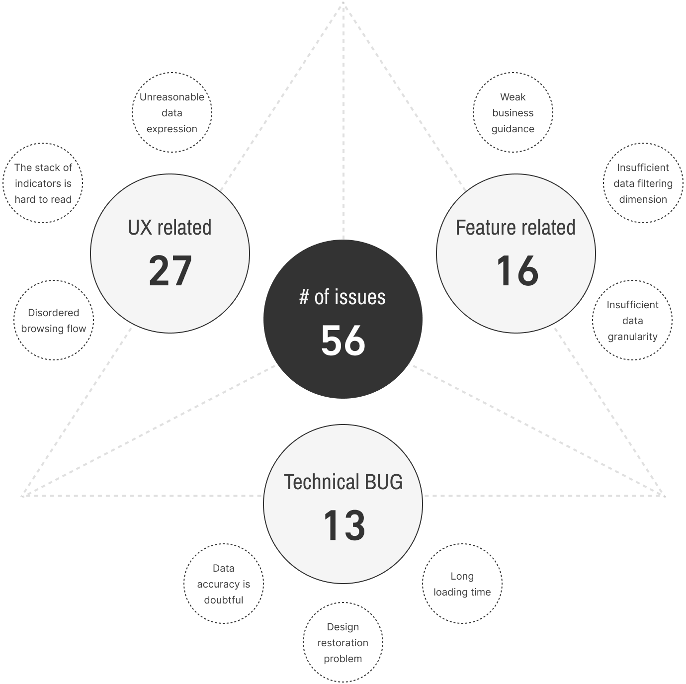
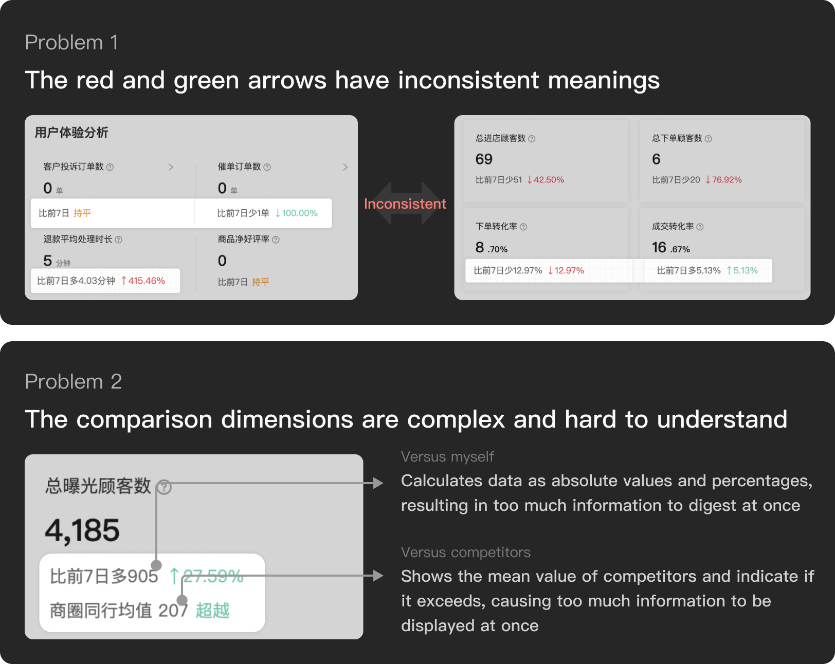
After walking through the data analysis module of both PC and APP, a total of 56 problems were found, of which 48.2% were ux-related problems, 28.6% were feature-related problems, and 23.2% were technical bug problems.

walkthrough
walkthrough

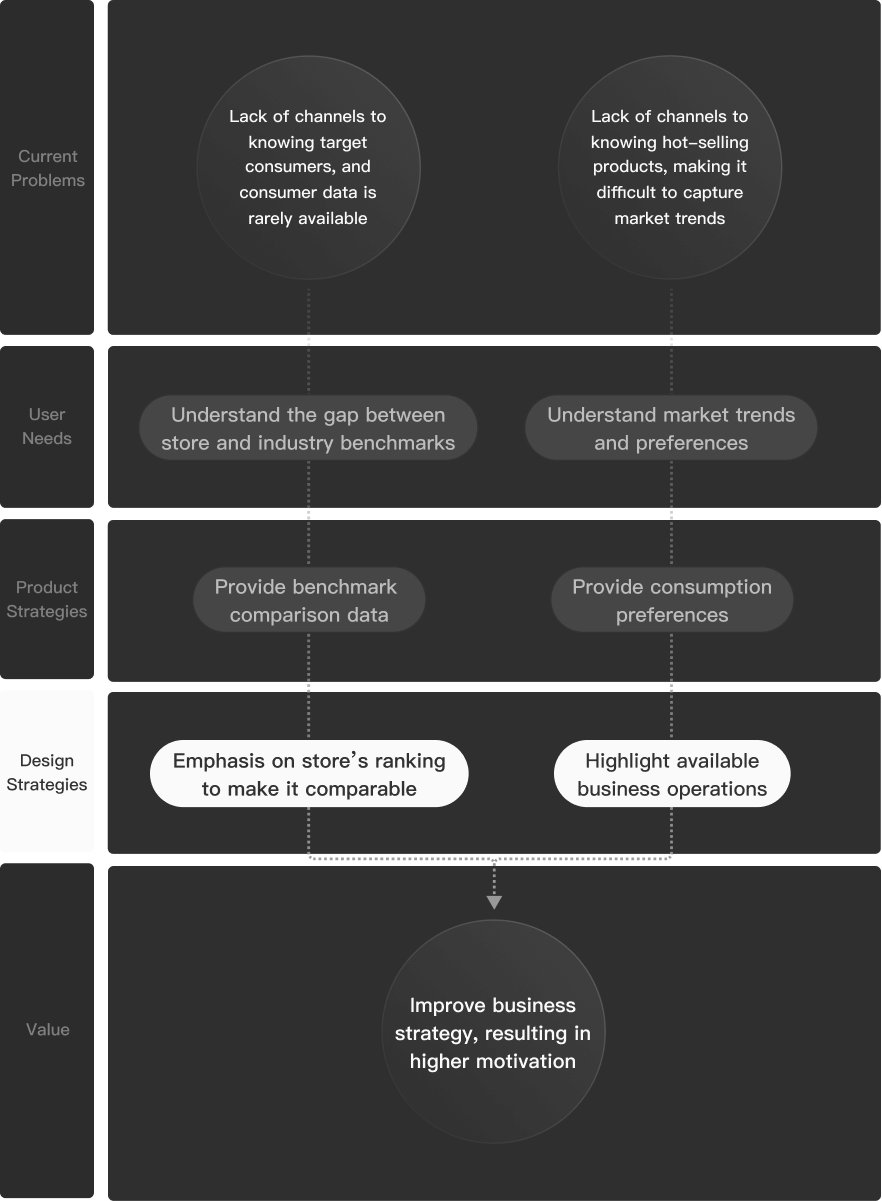
Meituan’s retail merchant side is the main direct competitor to us. In competitive analysis, I compared Meituan’s functionality and experience with Ele.me. After analyzing a total of 32 functions on PC and APP, it was found that 43.7% of the functions and experience lagged behind the competitor.

competitive-analysis

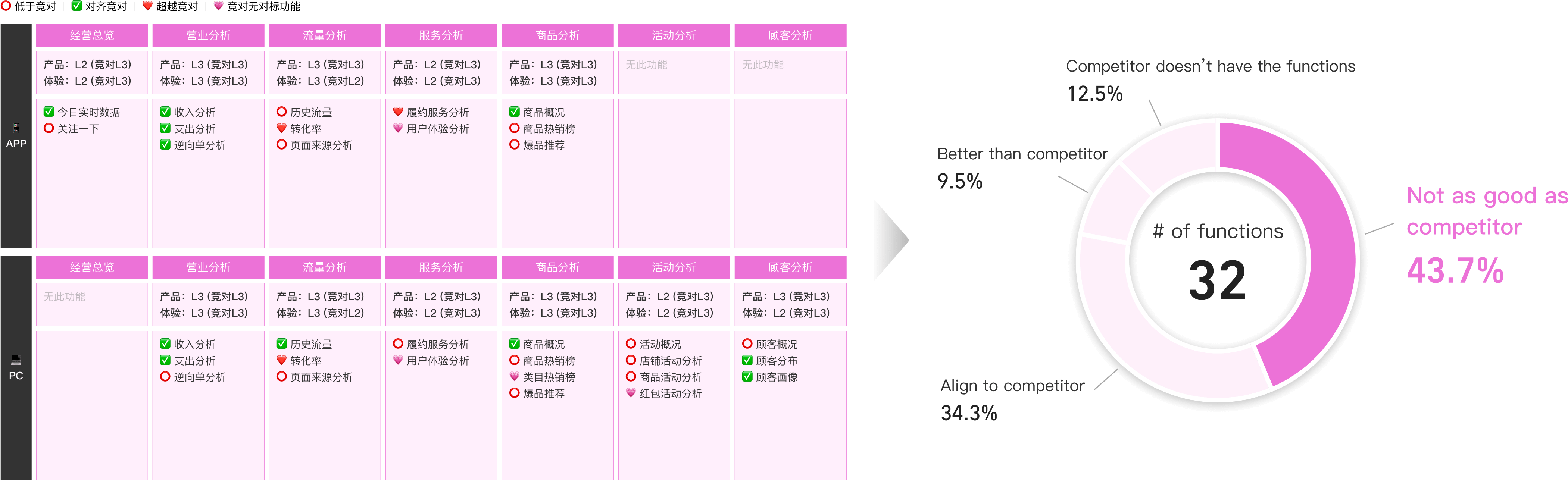
Compare with the competitor, the biggest problems are:

  • 1. Weak UI and page layout leading to high browsing effort
  • 2. Features provided are not as rich as the competitor
  • 3. The competitor provides business guidance that our product lacks

Problem attribution.

After sorting out the pain points extracted from the above research methods, the current problems in the data analysis module can be abstractly attributed to incomplete functionalities, incomprehensibility, and lack of business guidance.

attribution

Start from key issues and explore design opportunities.

strategy

More suitable functionalities.

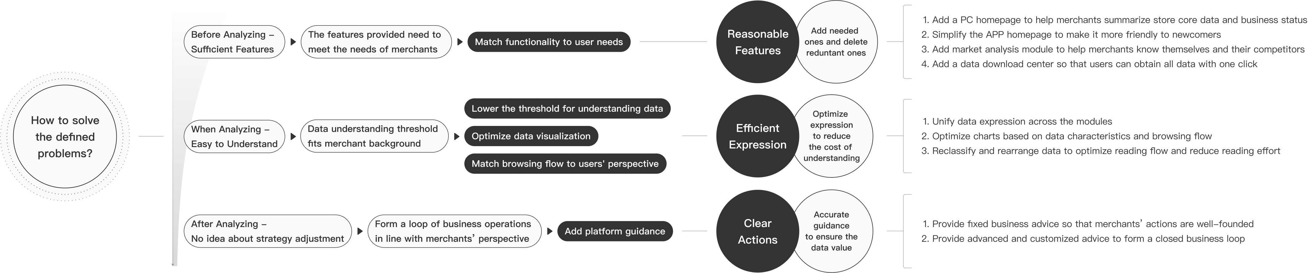
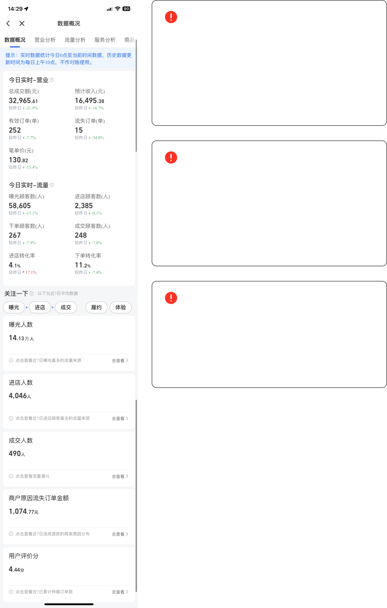
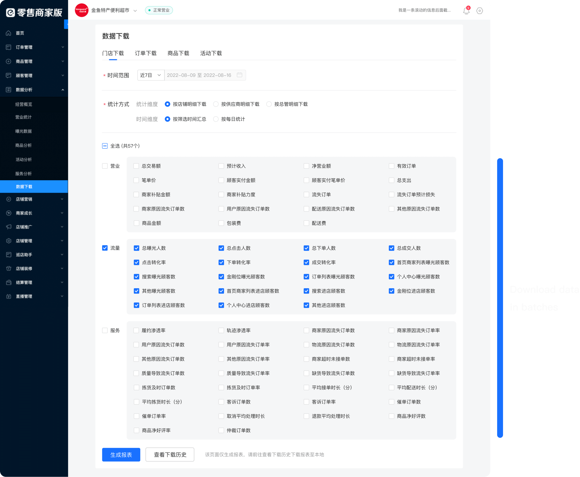
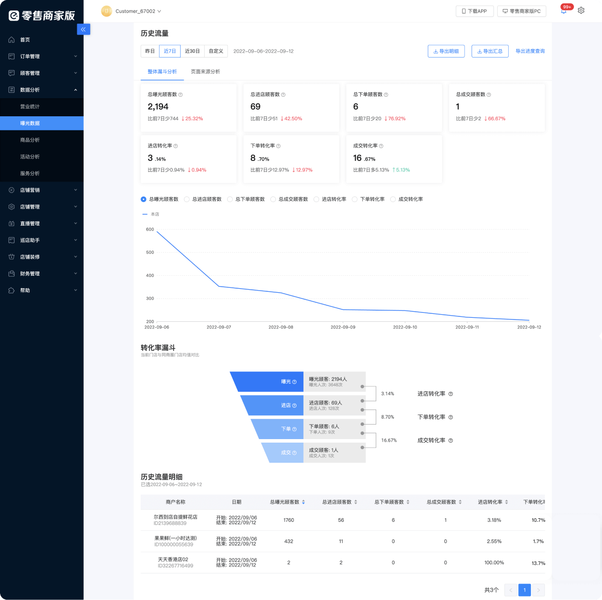
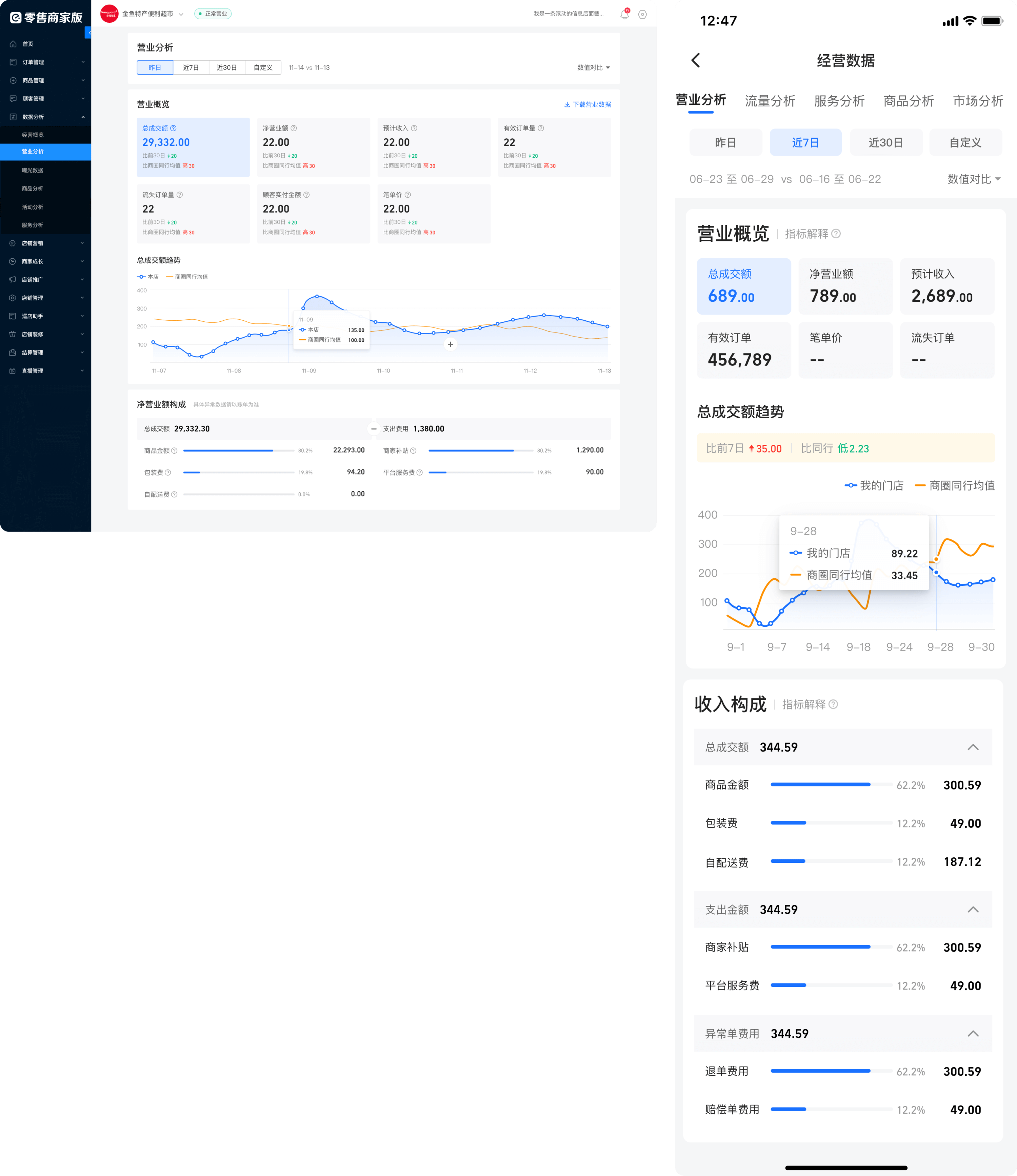
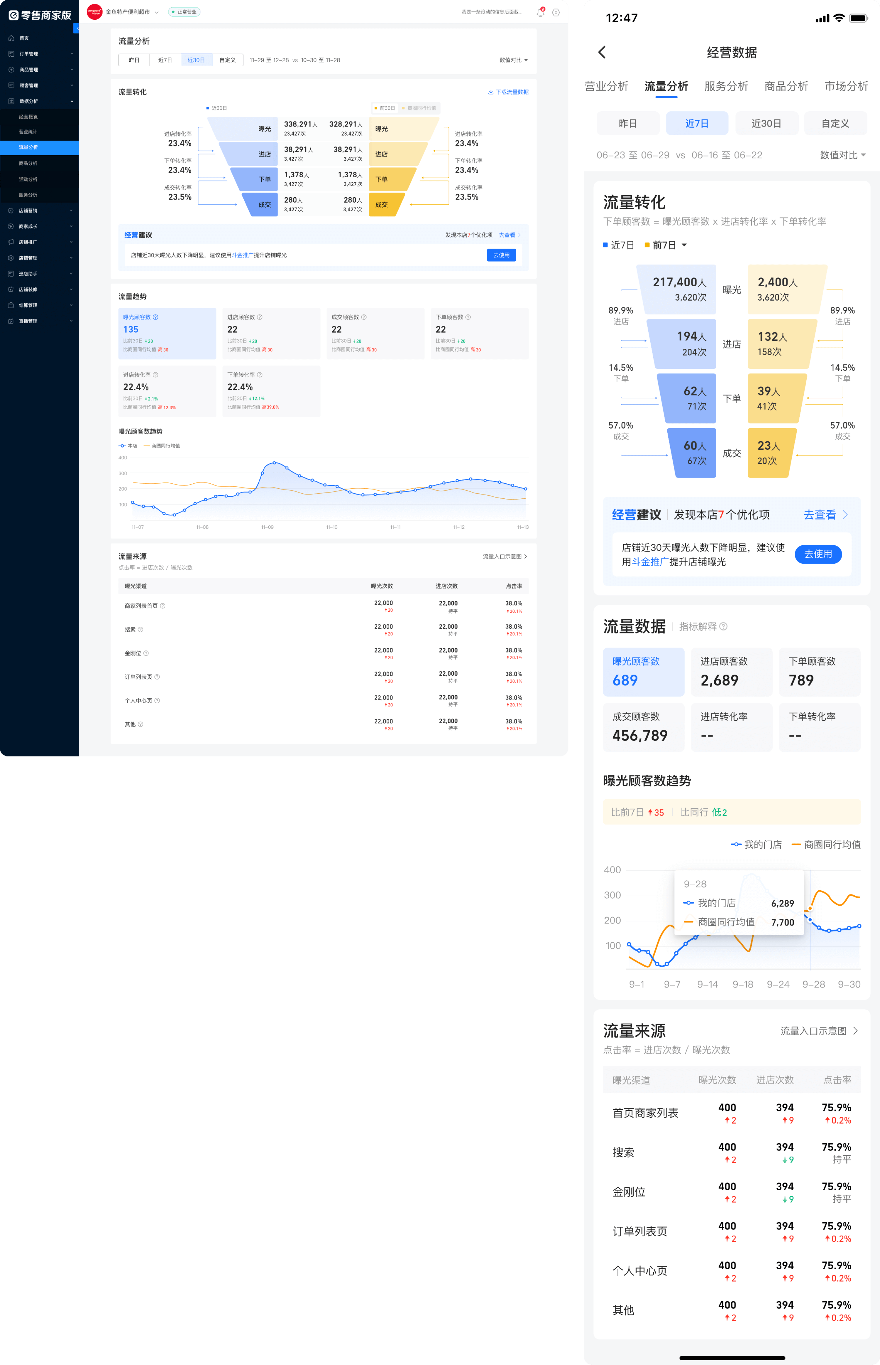
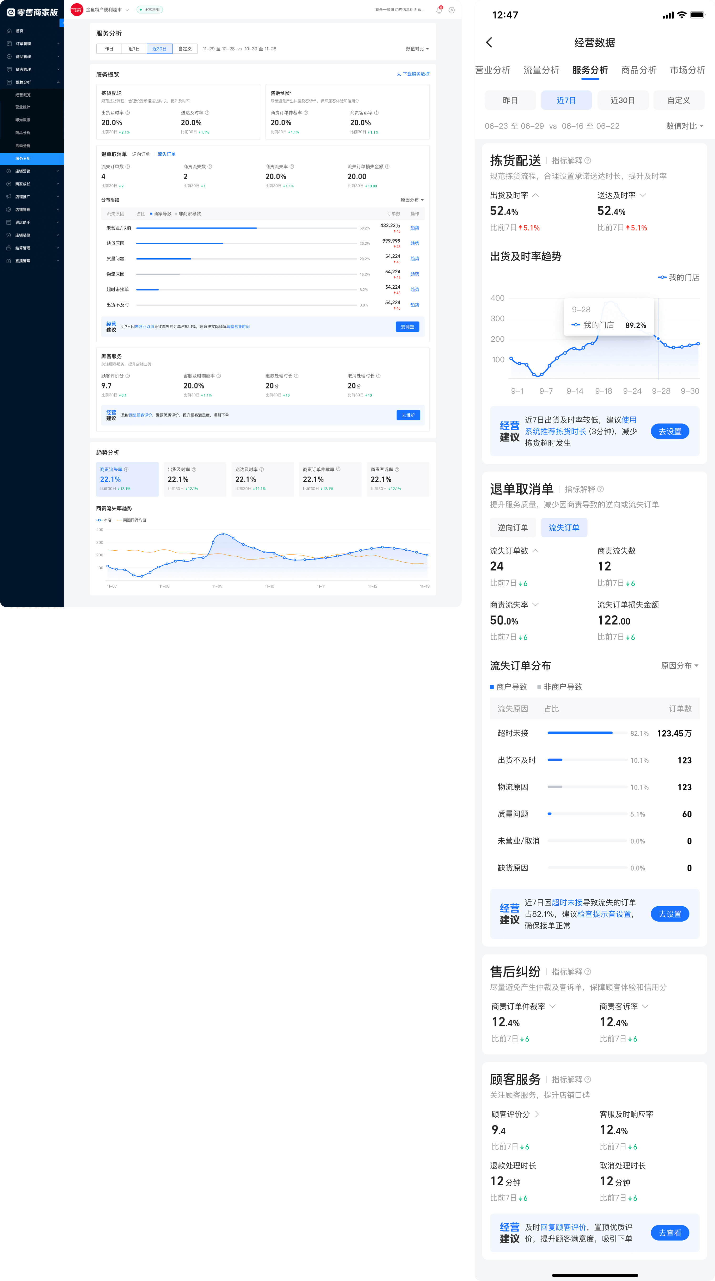
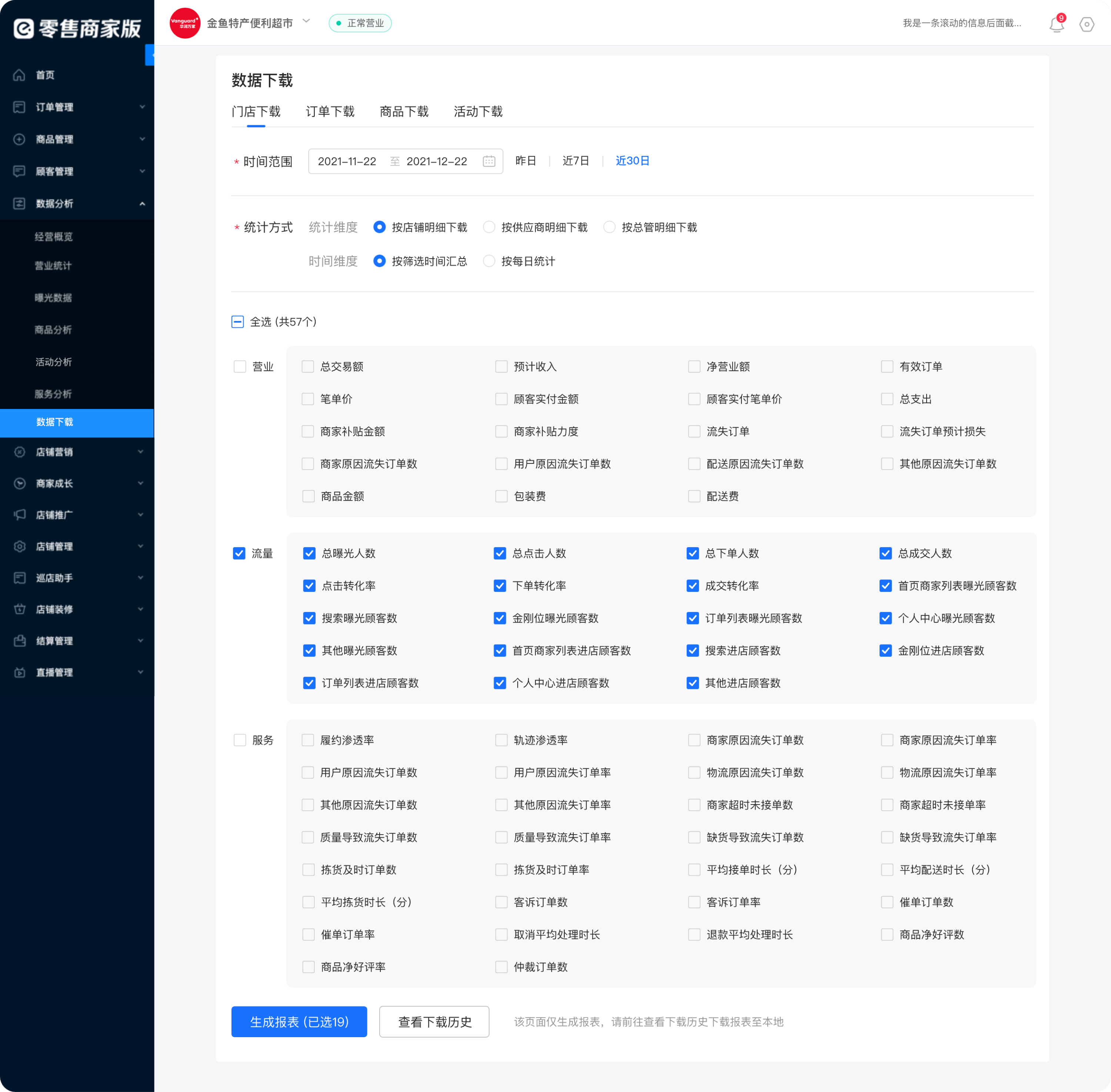
By adding a new PC data homepage, simplifying the APP data homepage, and adding market analysis and download capabilities, we can meet the data usage demands of merchants.

01

Matching features with demands   ▸   New homepage on PC

NEWA homepage is added to help merchants summarize store core data and understand business status comparsion-1-1-new
02

Matching features with demands   ▸   Simplify homepage on APP

BEFOREThe threshold for understanding indicators is high, indicators are piled up, and browsing flow is not smooth comparsion-3-1-before
AFTERSimplify the APP homepage based on a novice’s business perspective and reveal necessary guidance comparsion-3-1-after
03

Matching features with demands   ▸   Add market analysis to help merchants know the surroundings

NEWProvide market insight channels to help merchants know themselves and their competitors, and adjust business strategies accordingly
comparsion-1-1-new
comparsion-1-1-new
04

Matching features with demands   ▸   Add data download center

BEFOREThe download entrances for each section are discrete and need to be downloaded with many clicks comparsion-3-1-before
AFTERAdded download center so that user can check the corresponding categories to generate reports with only a few clicks comparsion-3-1-after

Efficient data expression.

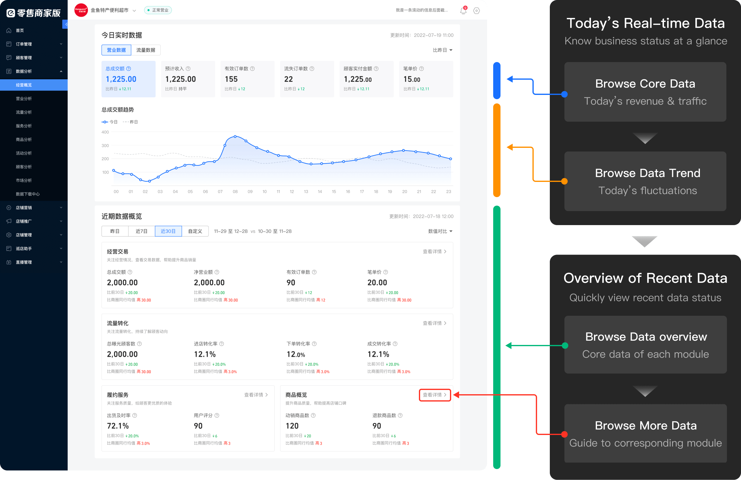
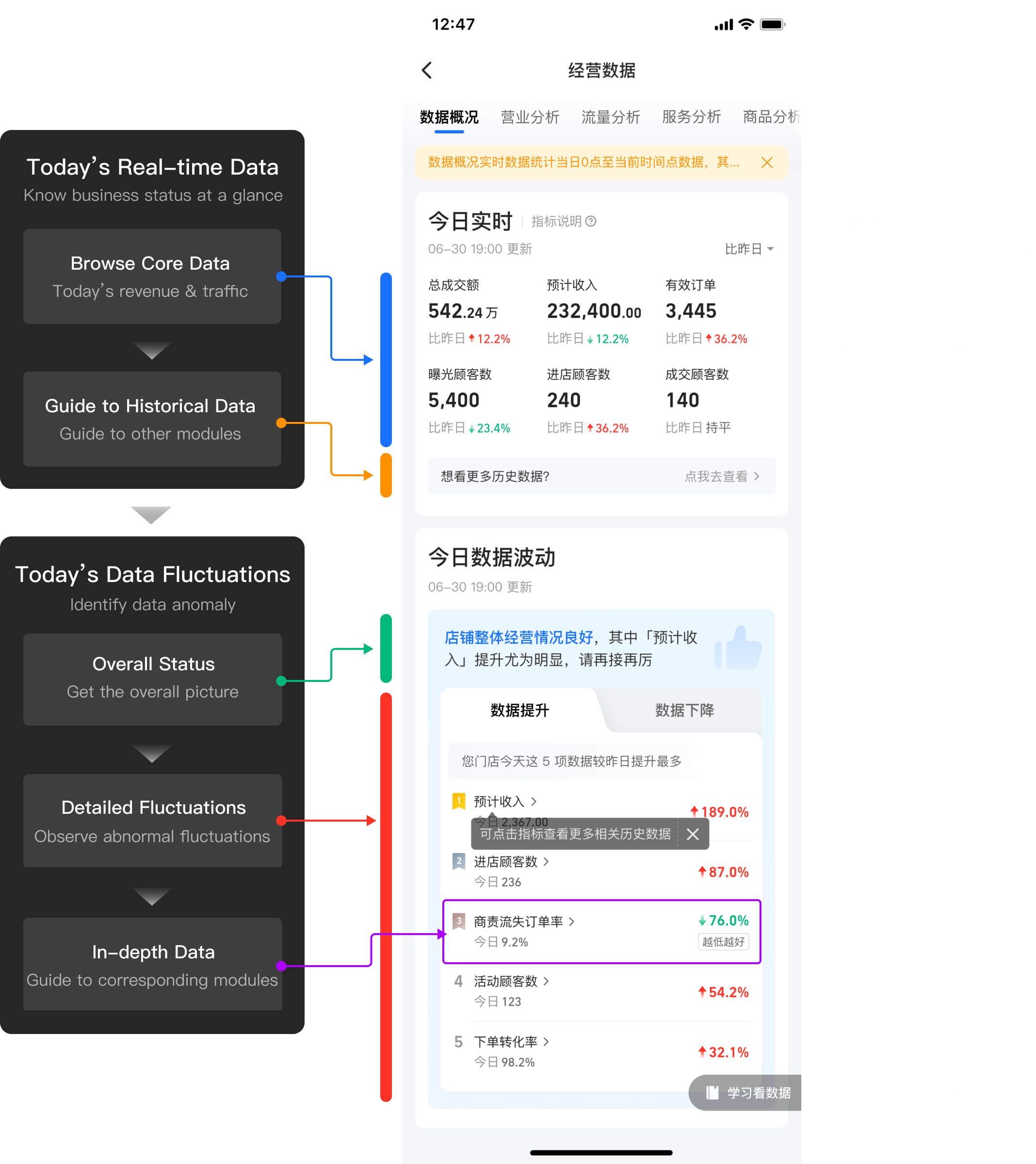
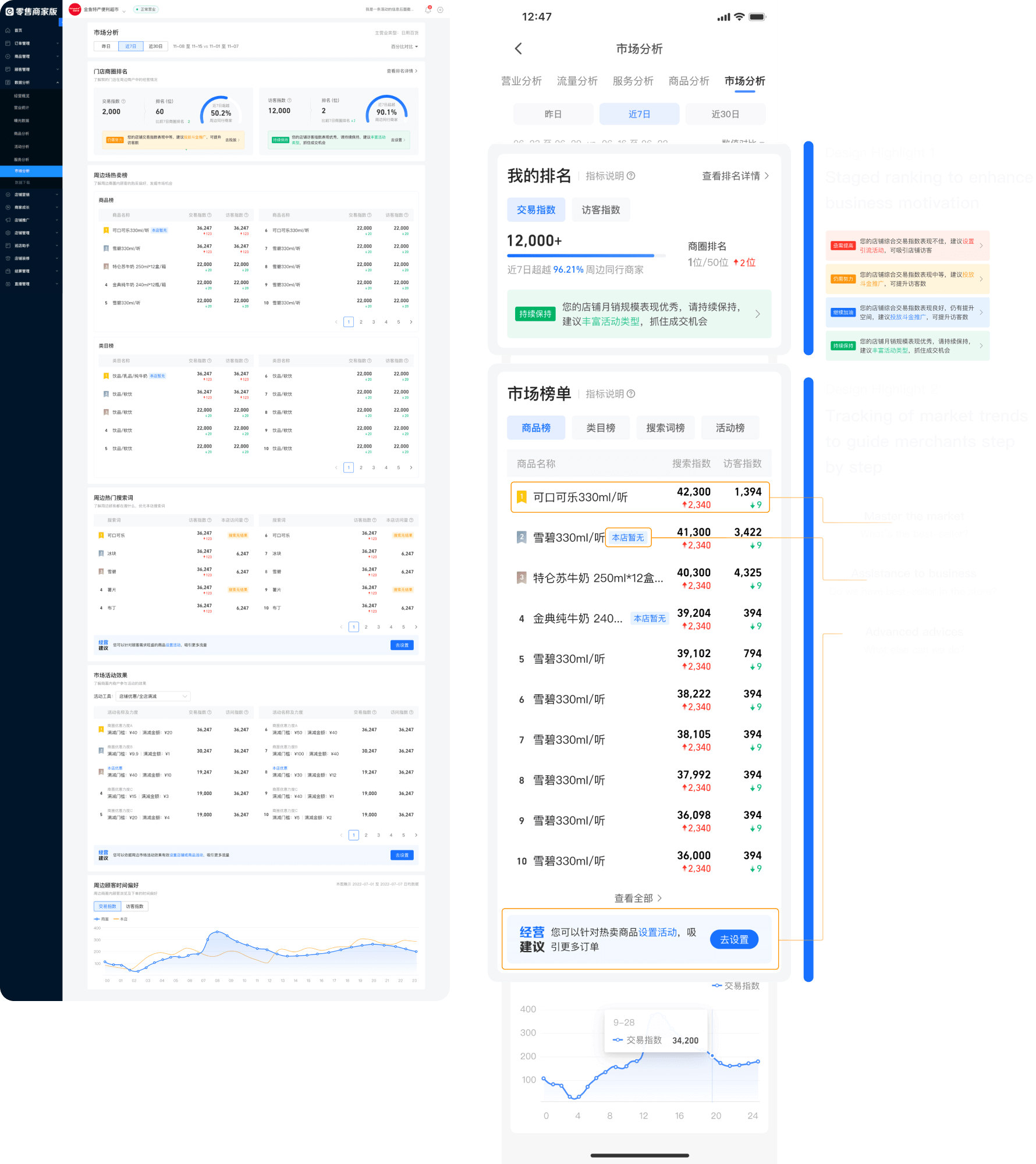
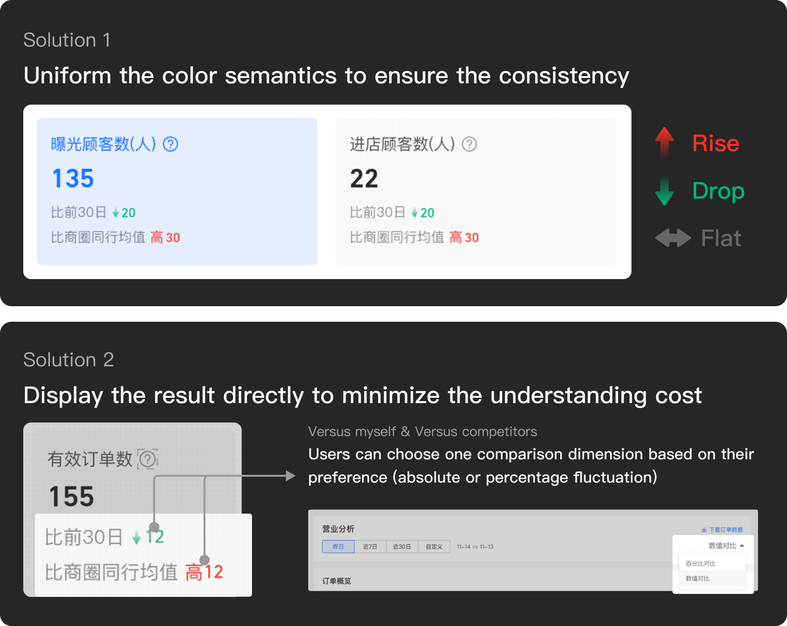
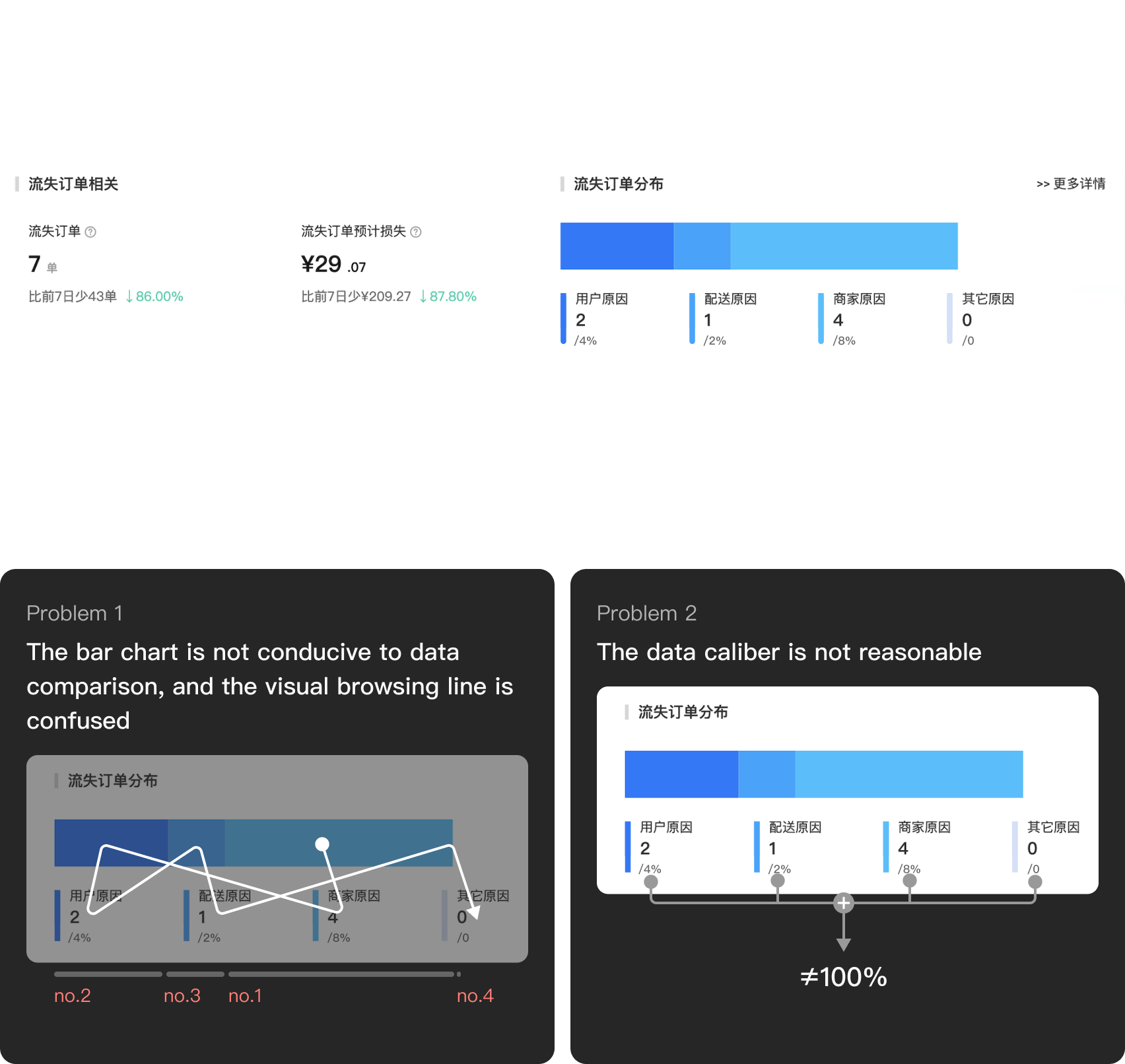
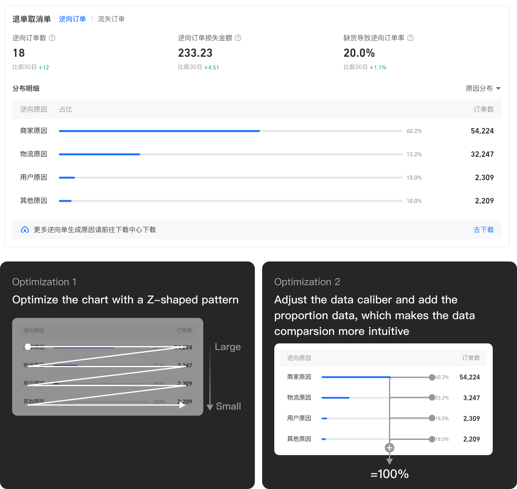
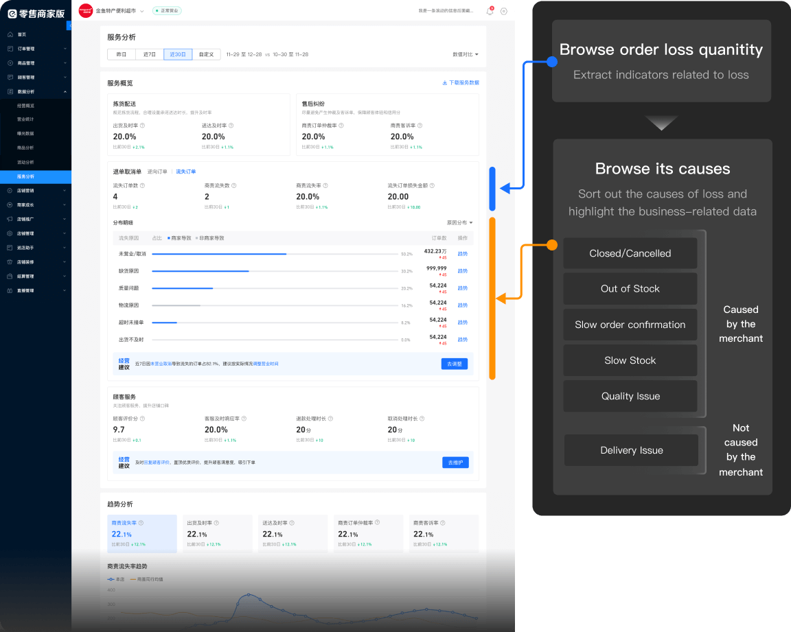
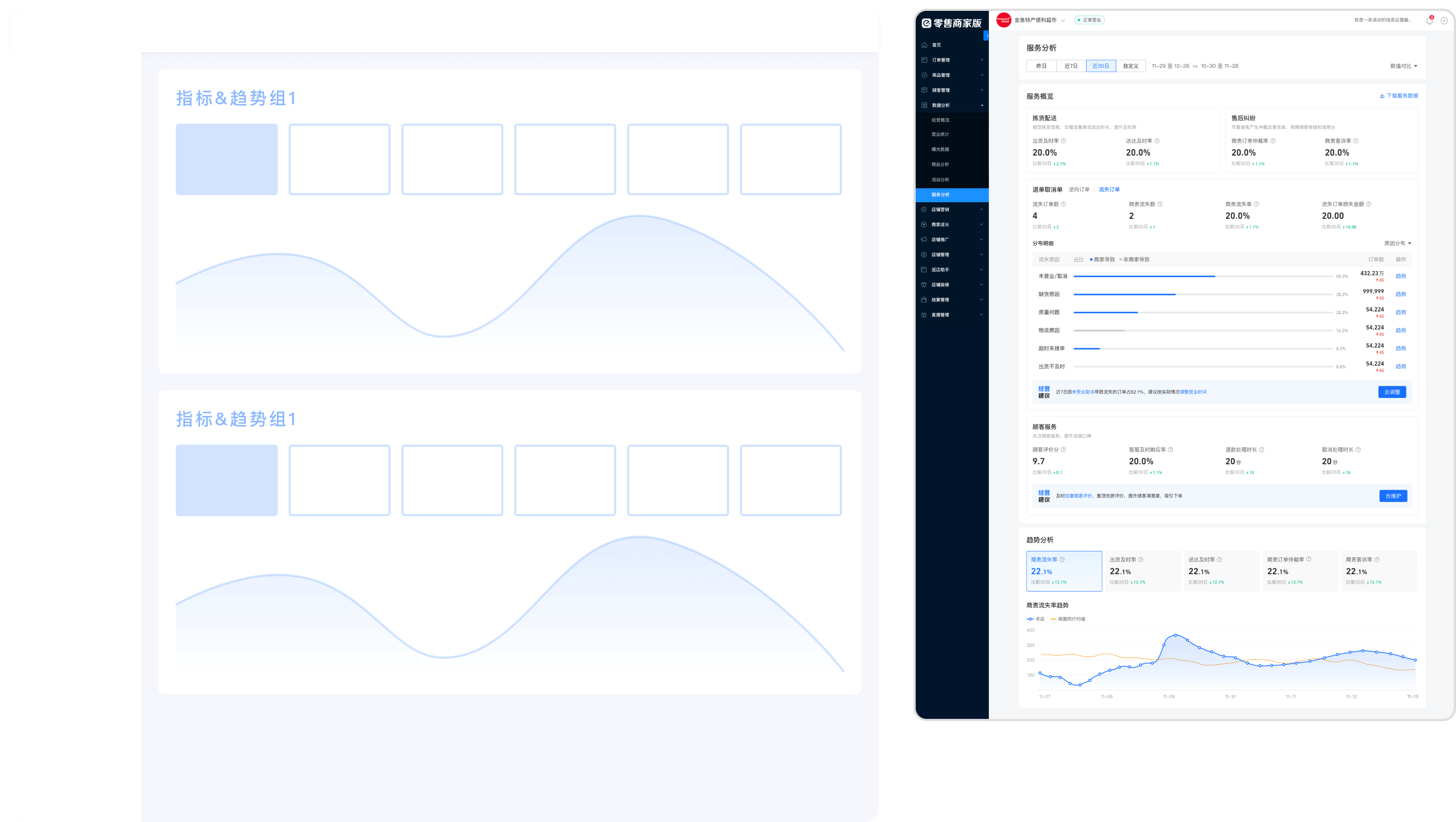
Through unifying data expression, optimizing data visualization, and reasonalizing browsing flow to make the pages simpler and easier to understand, which fits the merchants' background.

01

Lower the threshold of understanding   ▸   Unify and simplify data expression to reduce the reading burden

BEFOREExpressions in different sections are inconsistent comparsion-2-1-before
AFTERUnify and simplify expression to minimize the burden of understanding comparsion-2-1-after
02

Optimize data visualization   ▸   Optimize visual movement lines of charts based on the purpose of browsing

BEFOREThe expression of the graph is not intuitive and difficult to compare comparsion-2-2-before
AFTERData is easily comparable and the proportions are clear at a glance comparsion-2-2-after
03

Reclassify data to optimize flow   ▸   Optimize page structure based on data properties

BEFOREThe positive and negative data mixed with its corresponding reasons, which is hard to distinguish comparsion-2-3-before
AFTERReclassify data by expressing cause-related data with a bar gragh to make it easy to compare comparsion-2-3-after
04

Reclassify data to optimize flow   ▸   Restructure data expression based on user focus and rationalize the use of data charts

BEFOREThe indicators are stacked and difficult to read, and the browsing line jumps out of sequence comparsion-2-3-before
AFTERRestructure data to optimize the flow of data, and reduce reading effort comparsion-2-3-after

Actions are clearer.

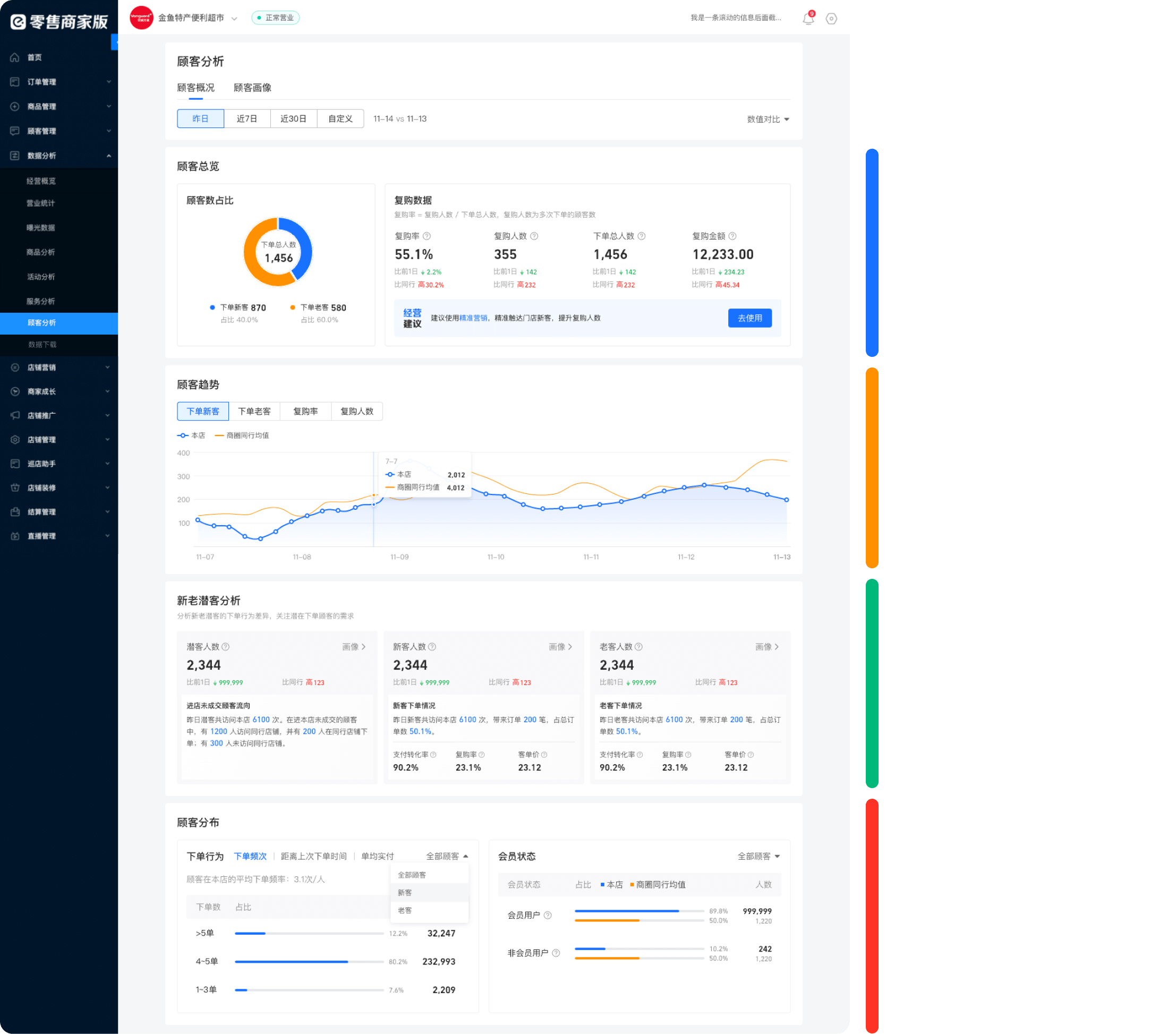
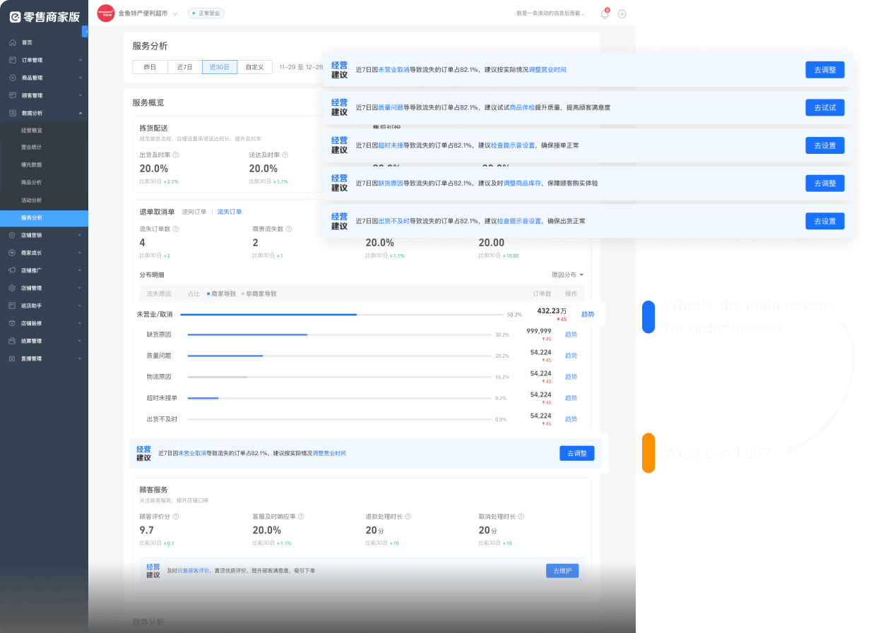
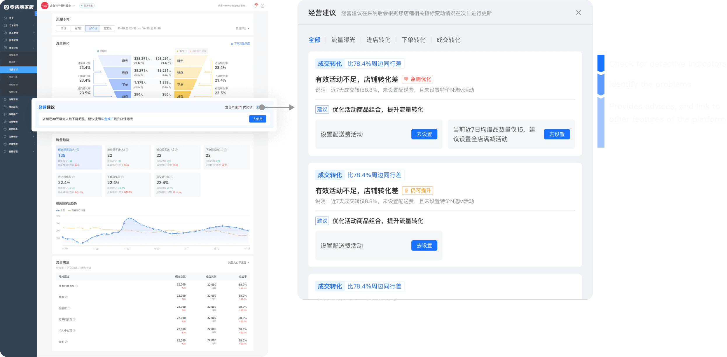
Provide business advice based on data conditions, which helps reflect the value of data.

01

Add guidance   ▸   Provide basic interpretation and suggested follow-up actions at low cost

BEFORELack of further guidance after reading data comparsion-3-1-before
AFTERProvide fixed advice and reveal the reasons behind it, so that merchants’ actions are well-founded comparsion-3-1-after
02

Add platform guidance   ▸   Advanced business advice, which provide best action guidance based on data performance

BEFOREMerchants are not able to do any further operations from pure data comparsion-3-1-before
AFTERProvide advanced business advice and link it to other modules on the platform to form a closed business loop comparsion-3-2-after

Differentiated design between PC and APP to ensure ease of use.

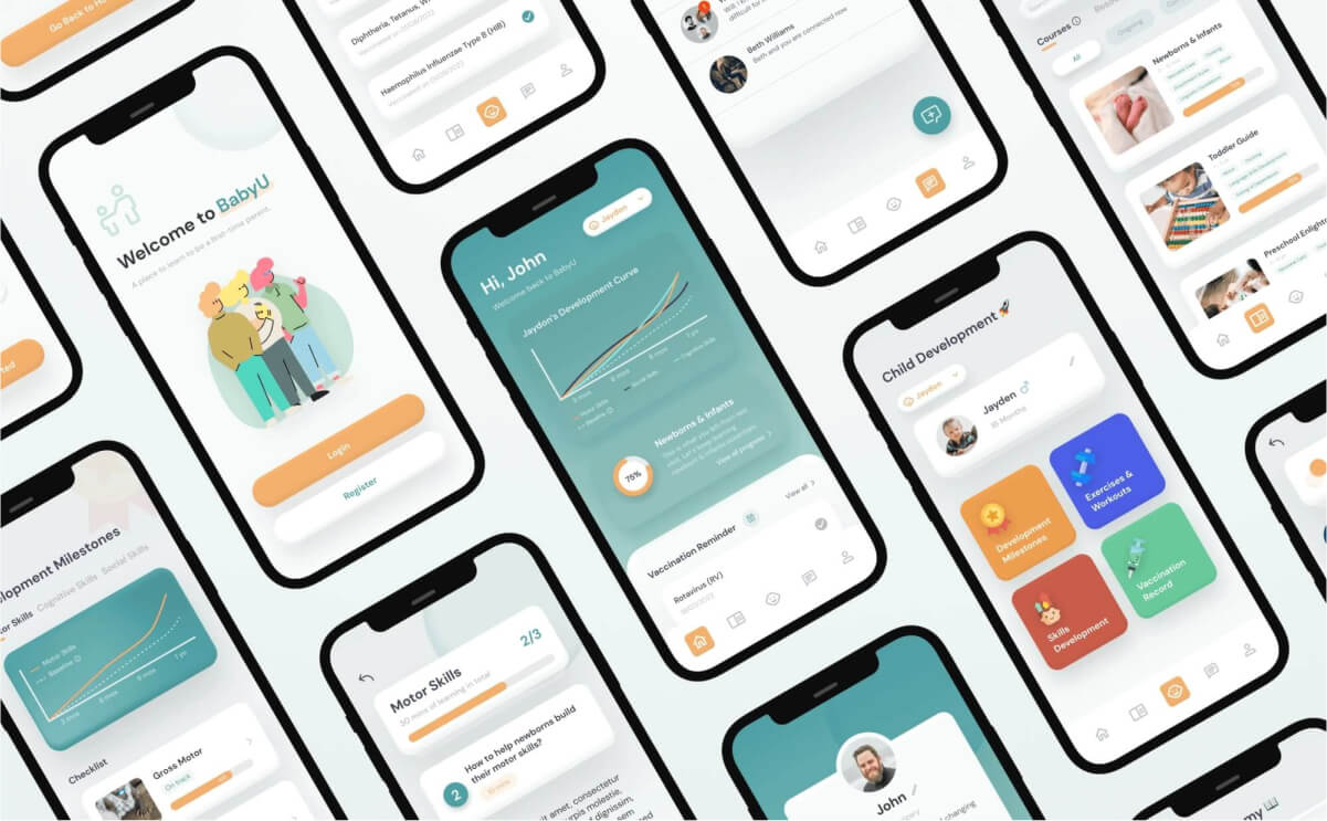
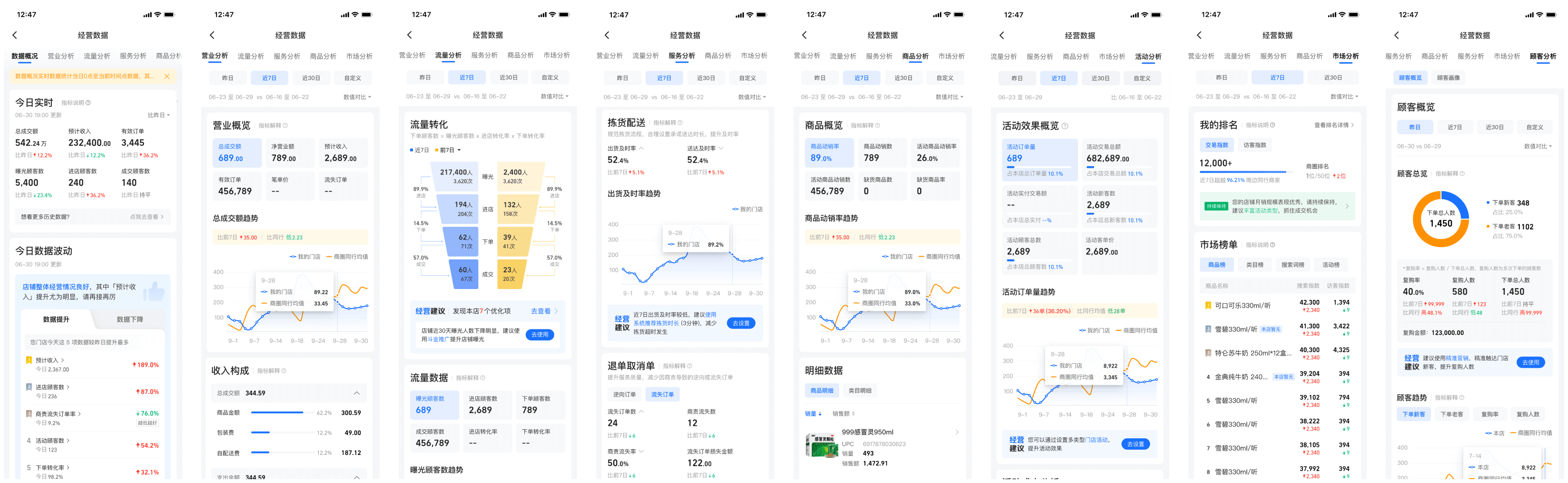
From previous research, I concluded that novice users prefer simple and clear information and are more accustomed to using APPs. As a result, the design of the mobile terminal is simplified to better fit the user context, while the differentiated design also helps ensure accessibility and ease of use on both terminals.

01

Expansion of interaction based on PC terminal

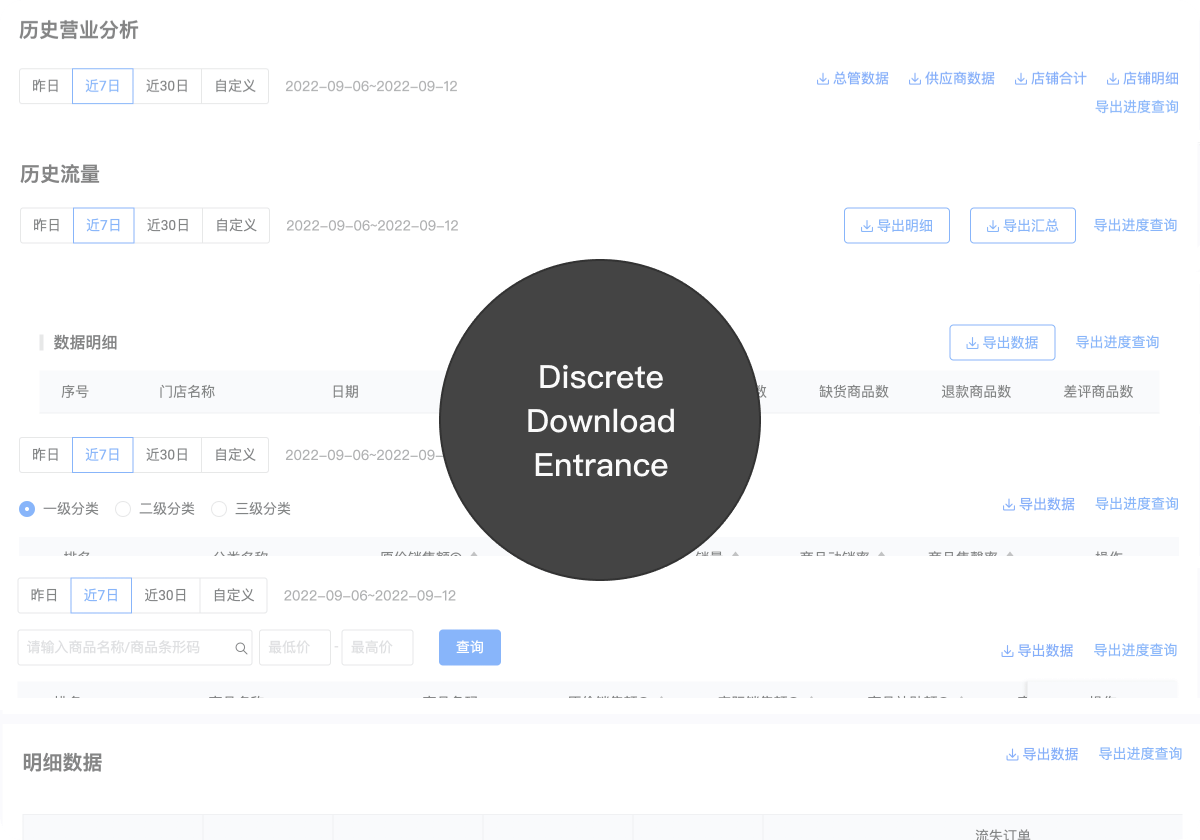
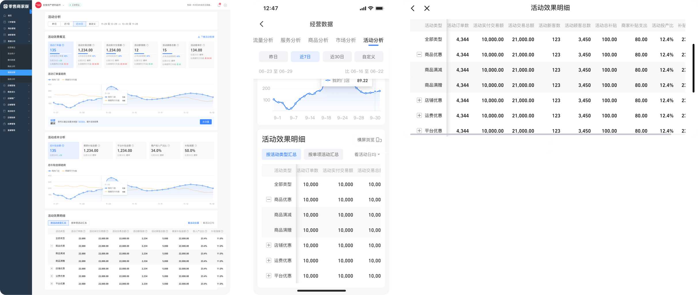
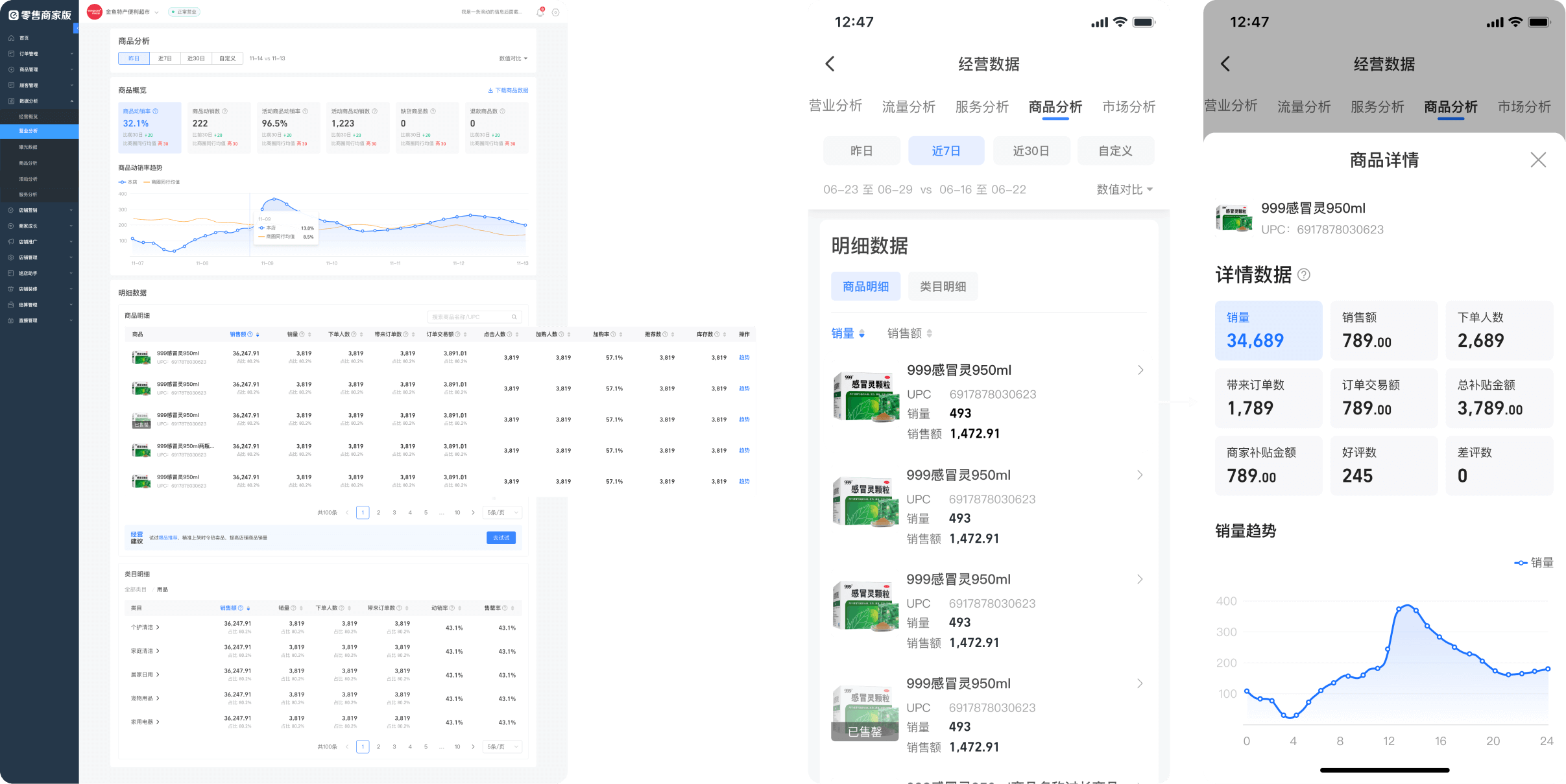
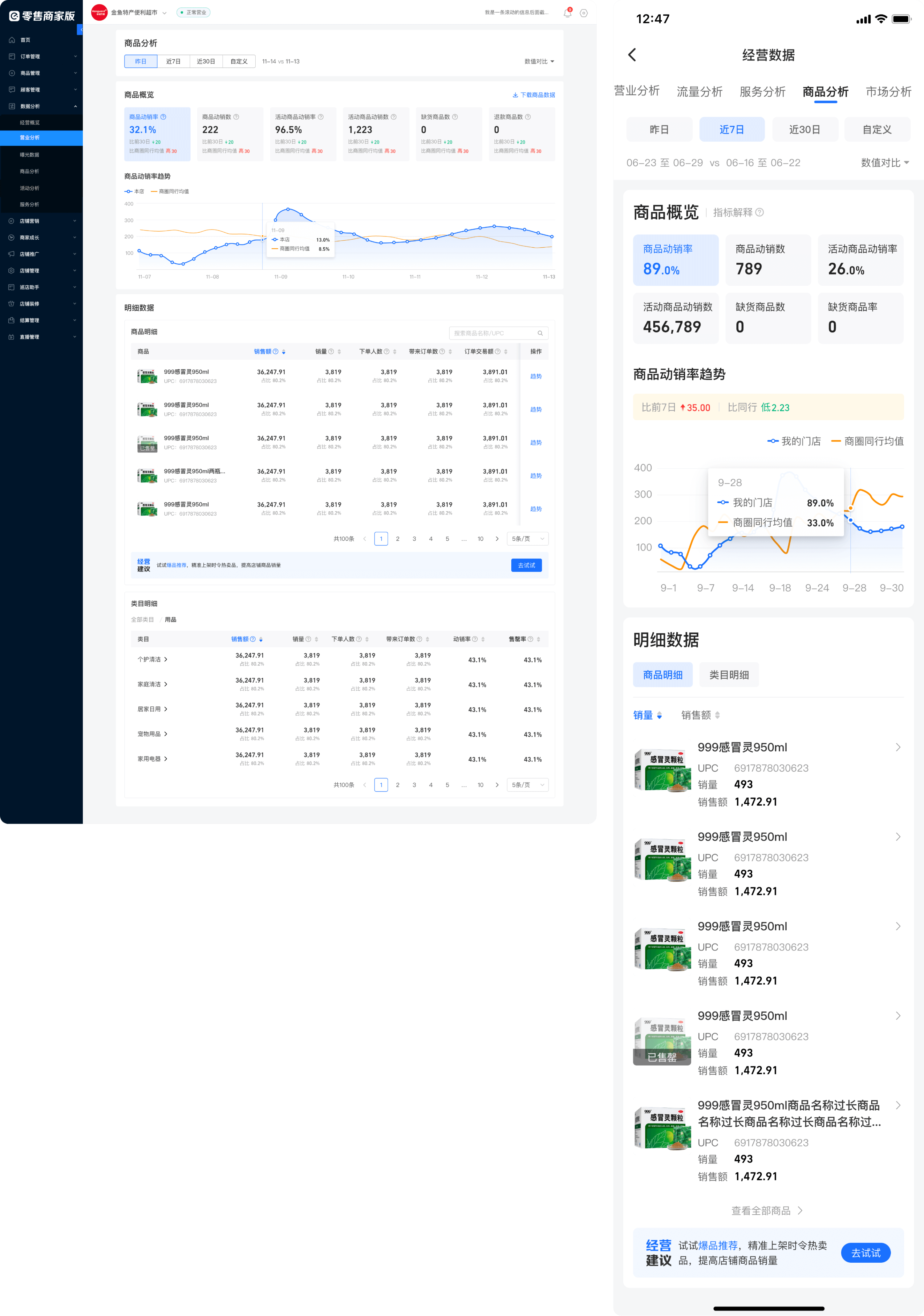
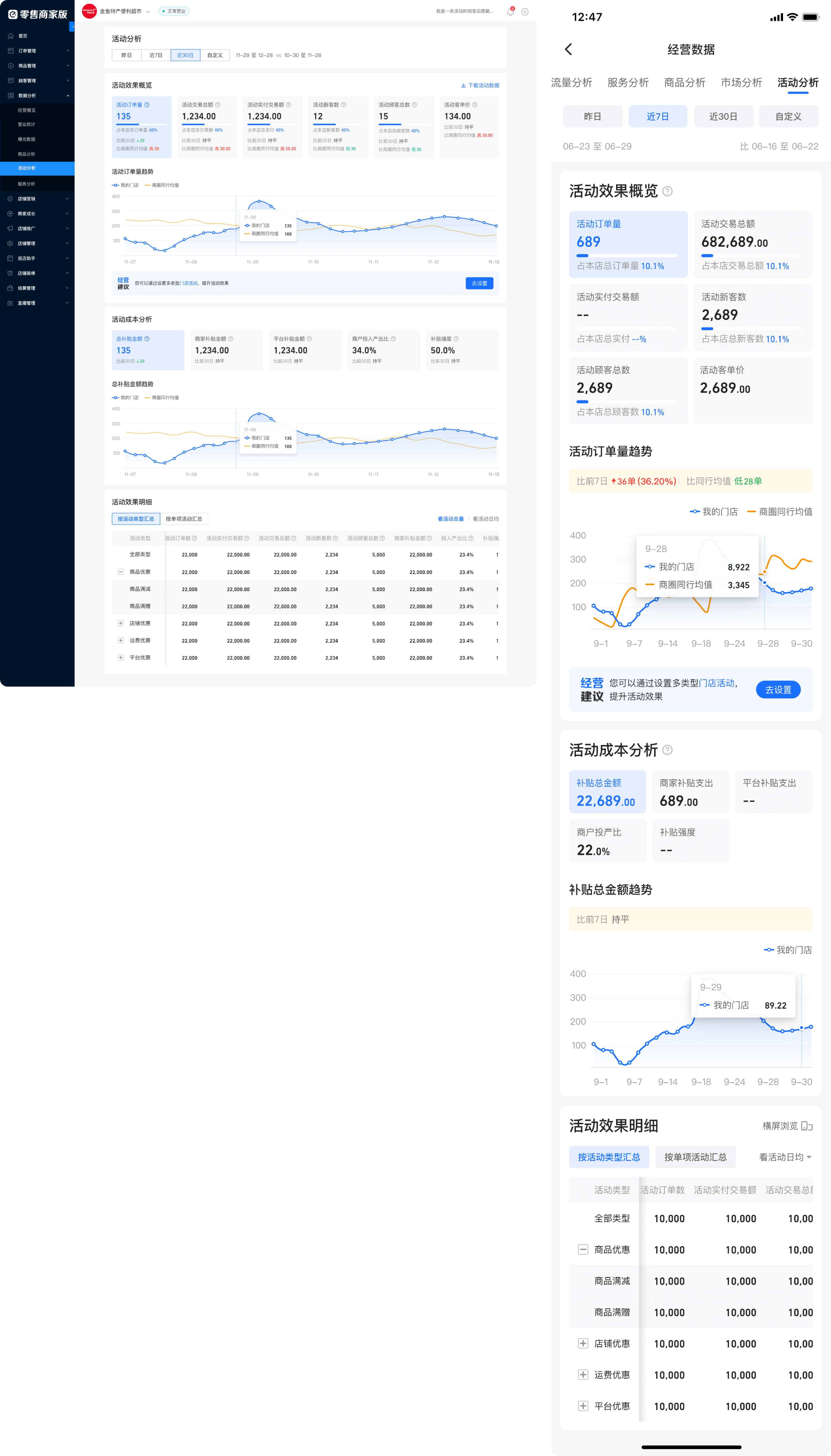
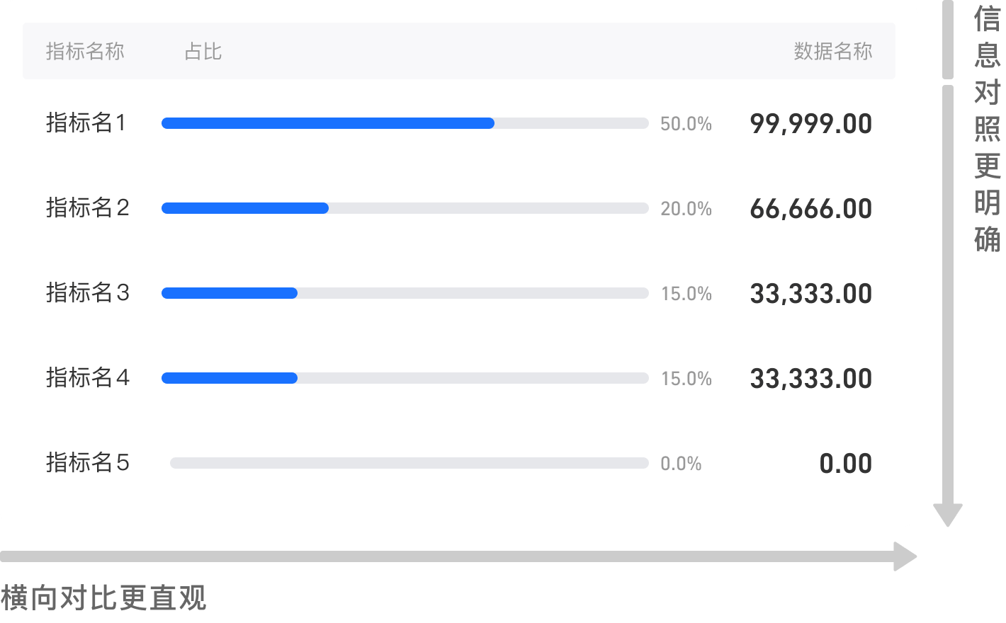
For example, in the display of promotion details, because there is a nested relationship in the data and the amount of data is large, it is better to use expandable tables on the PC side. In the APP, display is limited due to device width restrictions, so the "horizontal browsing mode" is added to ensure the data hierarchical structure while displaying more data in one screen.

comparsion-4-1
02

Differentiated interaction on PC and APP terminals

Same as the previous example, I used a "slideable table" for large amount of data, displaying the merchandise details. Since the APP side is mostly used by novice merchants, who pay most attention to "sale" and "sales volume". Therefore, folding interaction is adopted to only reveal the data they most care about the most on the first screen. And they can read more detailed data in the sheet if needed.

comparsion-4-2

High-fidelity prototype.

Home Page.
High fidelity prototype of the main page
Business Analysis.
High fidelity prototype of the business analysis page
Traffic Analysis.
High fidelity prototype of the traffic analysis page
Service Analysis.
High fidelity prototype of the service analysis page
Merchandise Analysis.
High fidelity prototype of the merchandise analysis page
Promotion Analysis.
High fidelity prototype of the promotion analysis page
Market Analysis.
High fidelity prototype of the market analysis page
Customer Analysis.
High fidelity prototype of the customer analysis page
Data Download Center.
High fidelity prototype of the download page

Abstract data components to be reused later.

Based on this project, 2 new data components have been abstracted. The components can be reused in a variety of scenarios to ensure product experience consistencys and improve design efficiency.

Component 1: indicators link with trends
BEFOREThe distance between the data indicators and the corresponding trends is far away, which does not fit the merchant's reading habit of "looking at indicators -> finding anomalies -> drilling down to see trends" comparsion-3-1-before
AFTERUses "Indicator->Trend" as a set of rationalized browsing lines, with flexible interactions. The structure can be reused in many places. comparsion-3-1-before
Component 2: "tabular" bar chart
BEFOREIn scenarios with many legends/close data, comparison is not intuitive in a pie chart comparsion-3-1-before
AFTERA new "tabular" bar chart is added to support intuitive comparsion comparsion-3-1-before

Project review.

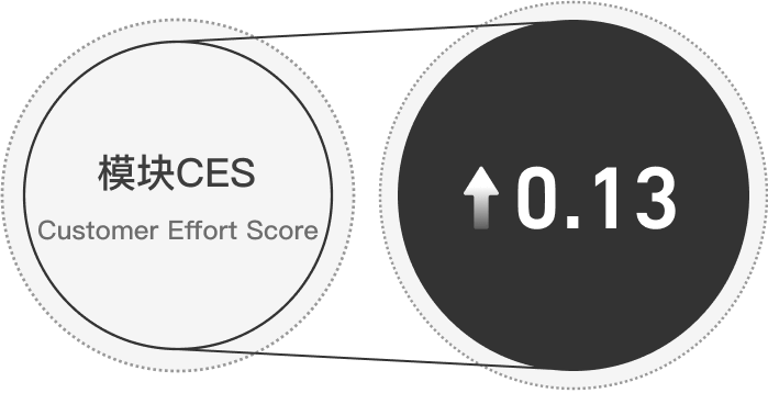
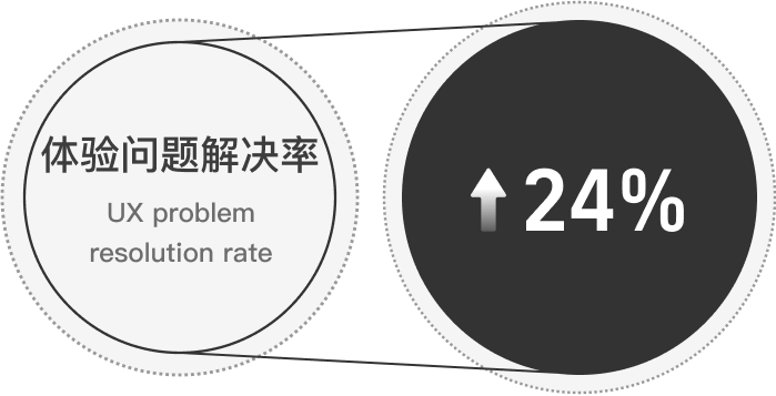
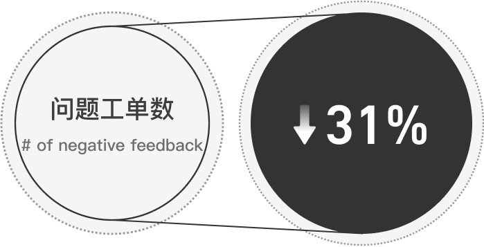
After reviewing the data results after the project was launched, CES score, ux problem resolution rate, and number of problem tickets all showed positive improvements.

CES result increased 0.15
solved 72.4% of the ux problems
negative feedback decreased 30.7%
👍 What I did well
  • The project had a tight deadline, and it was my first project when joining the company. Still, I was able to quickly familiarize myself with the company, project backgounrd, and finally define problems
  • There are differentiated designs based on the characteristics of PC and APP.
  • I have abstracted data components to produce reusable resources.
💪 What could I improve if given a second chance
  • I lacked a global design perspective when design the first few pages, resulting in the need to go back and modify some designs when the design frame cannot be used in some pages. If I have a chance to do a project with pages that have commonality in the future, I should consider scalability as much as possible in the early stage to avoid repeated modifications.

Next steps.

Continue to explore how to make the data analysis module more concise and easy to understand on the APP side. Here are some ideas:

  1. Enhanced analysis: Make enhanced expressions on charts to highlight some data that need attention.
  2. Folding interaction: Only display necessary data and keep the page simple. Only display advanced data when there is a need.
  3. Designer-driven design: Fit the structure of the martini glass. Strictly design the viewing paths and dominates the user's browsing flow.

👀 Random Projects.

🎲 Shuffle