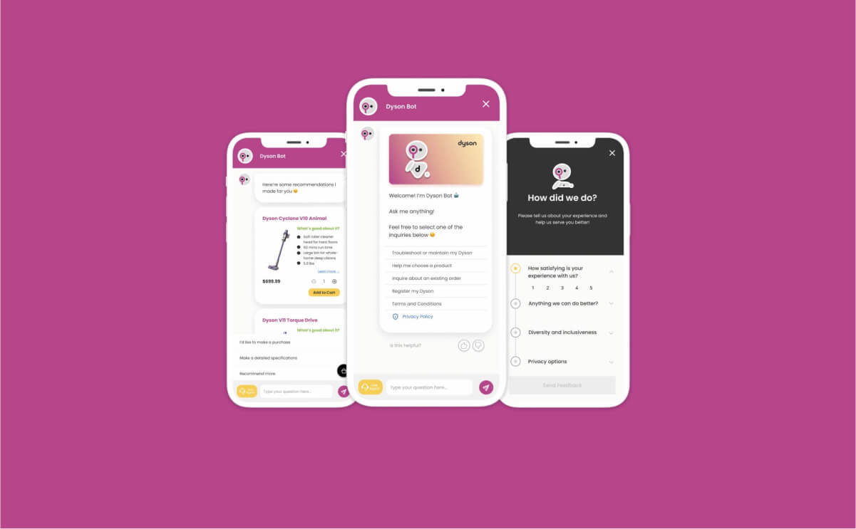
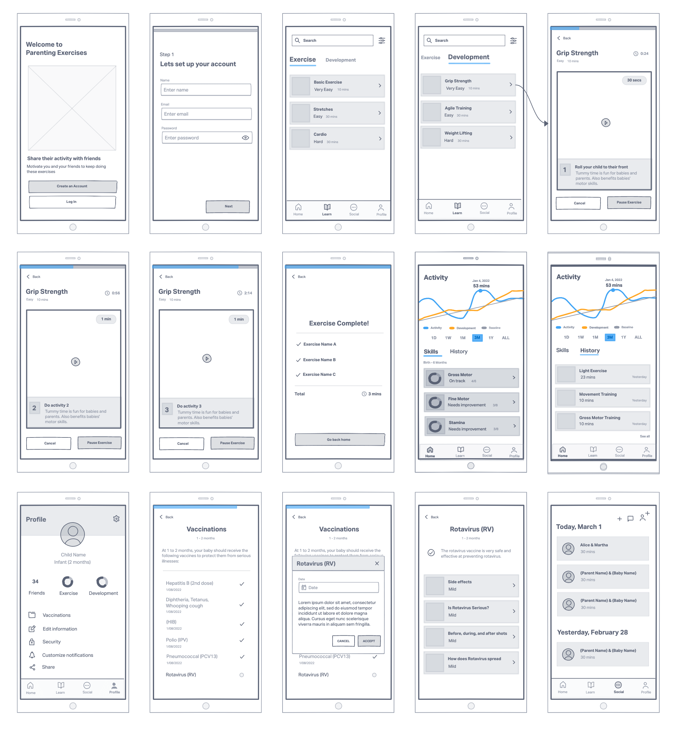
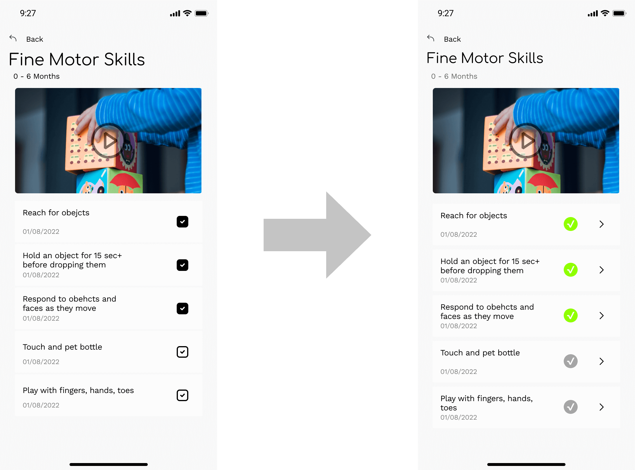
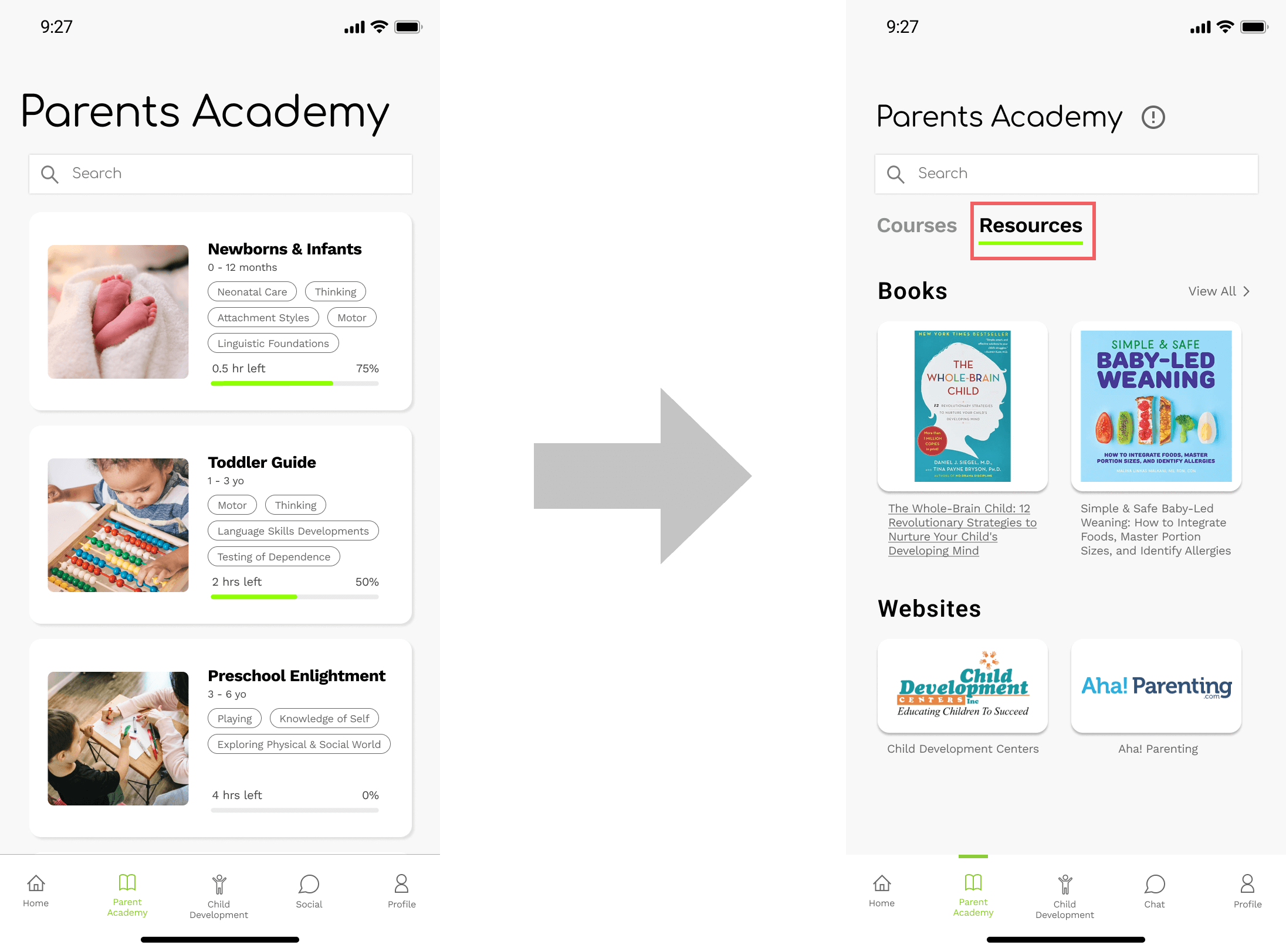
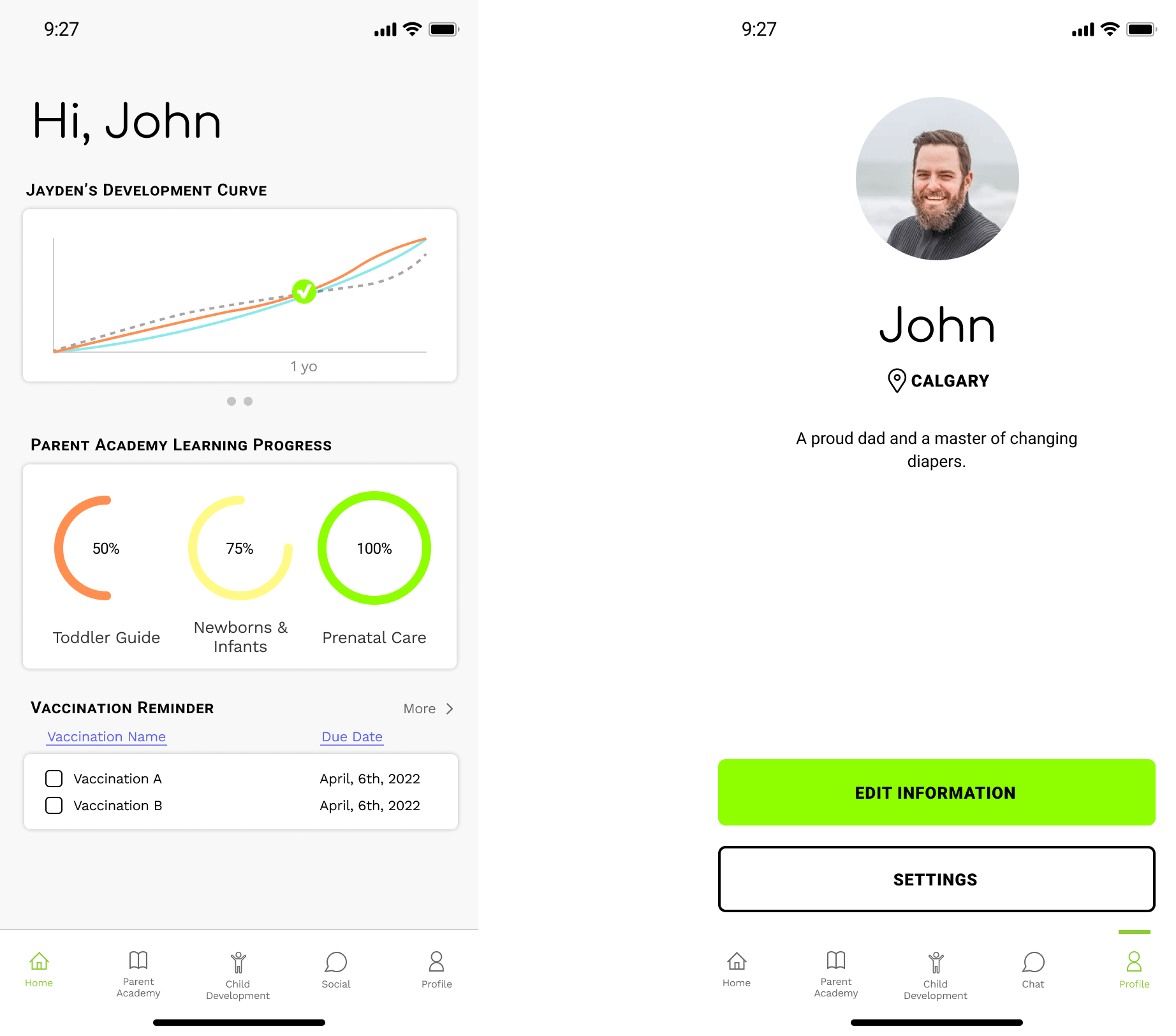
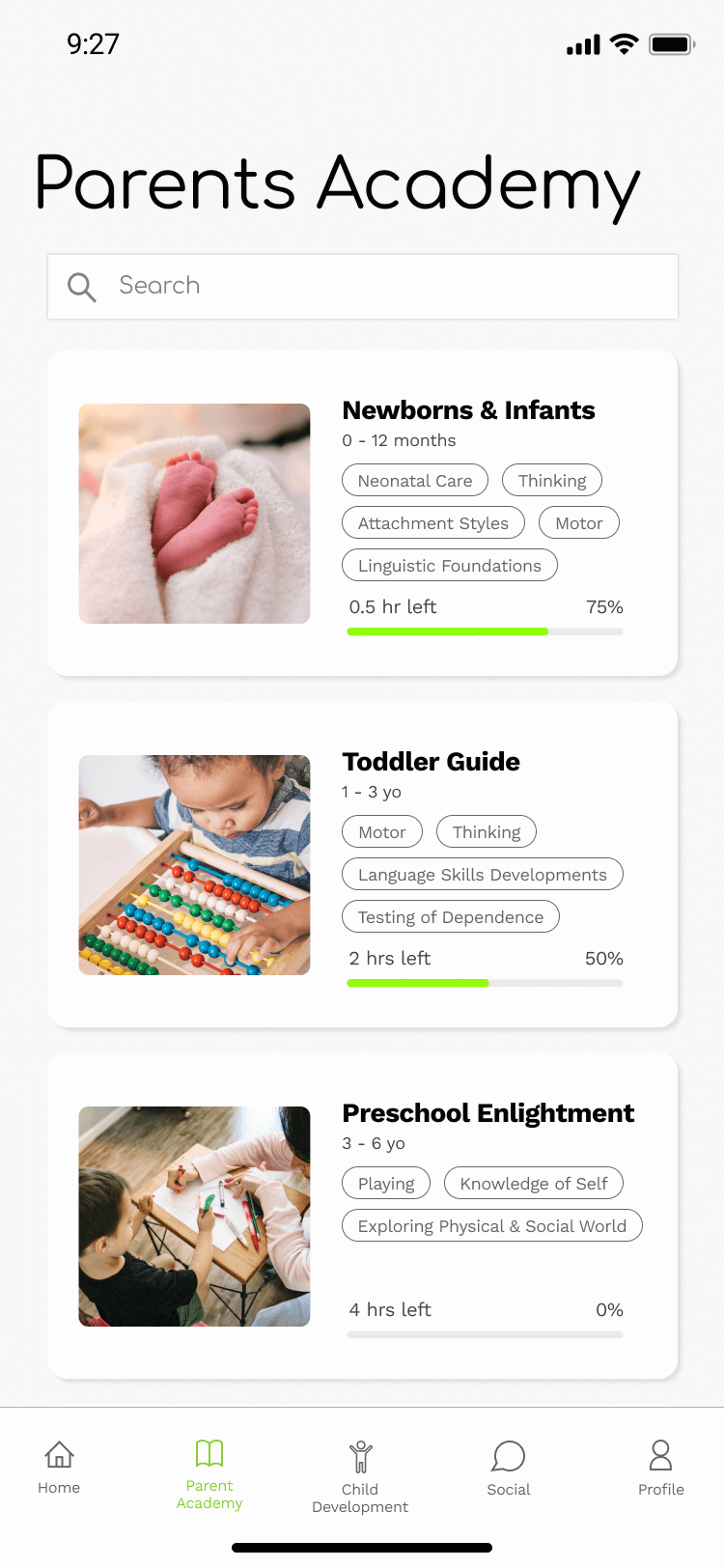
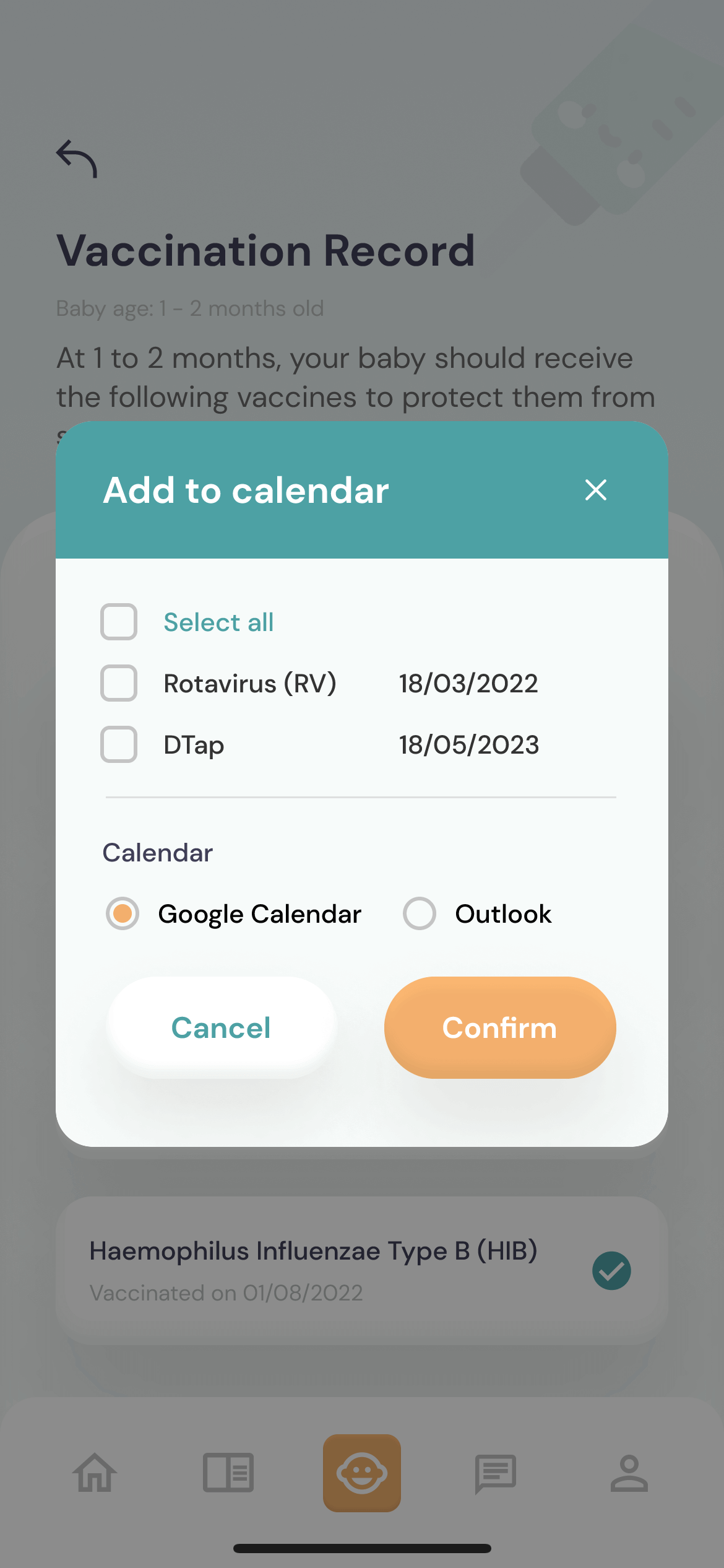
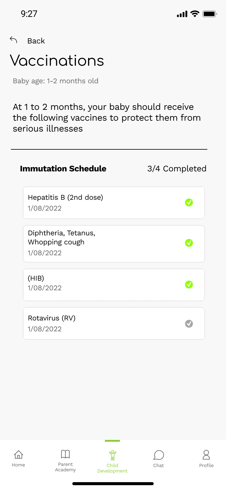
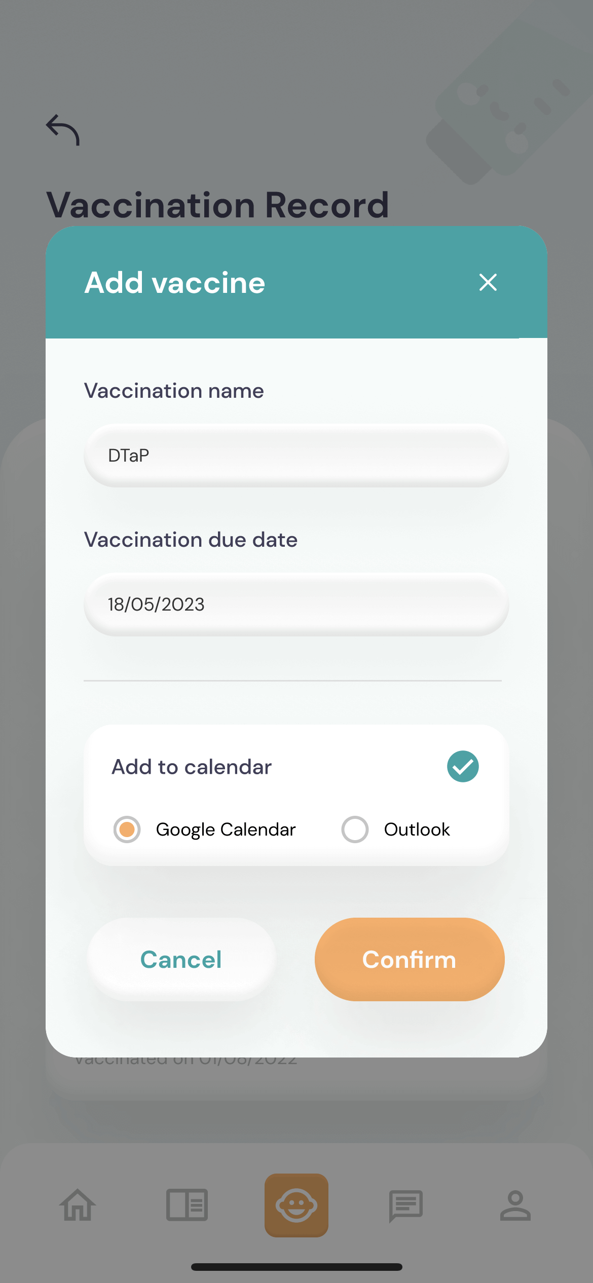
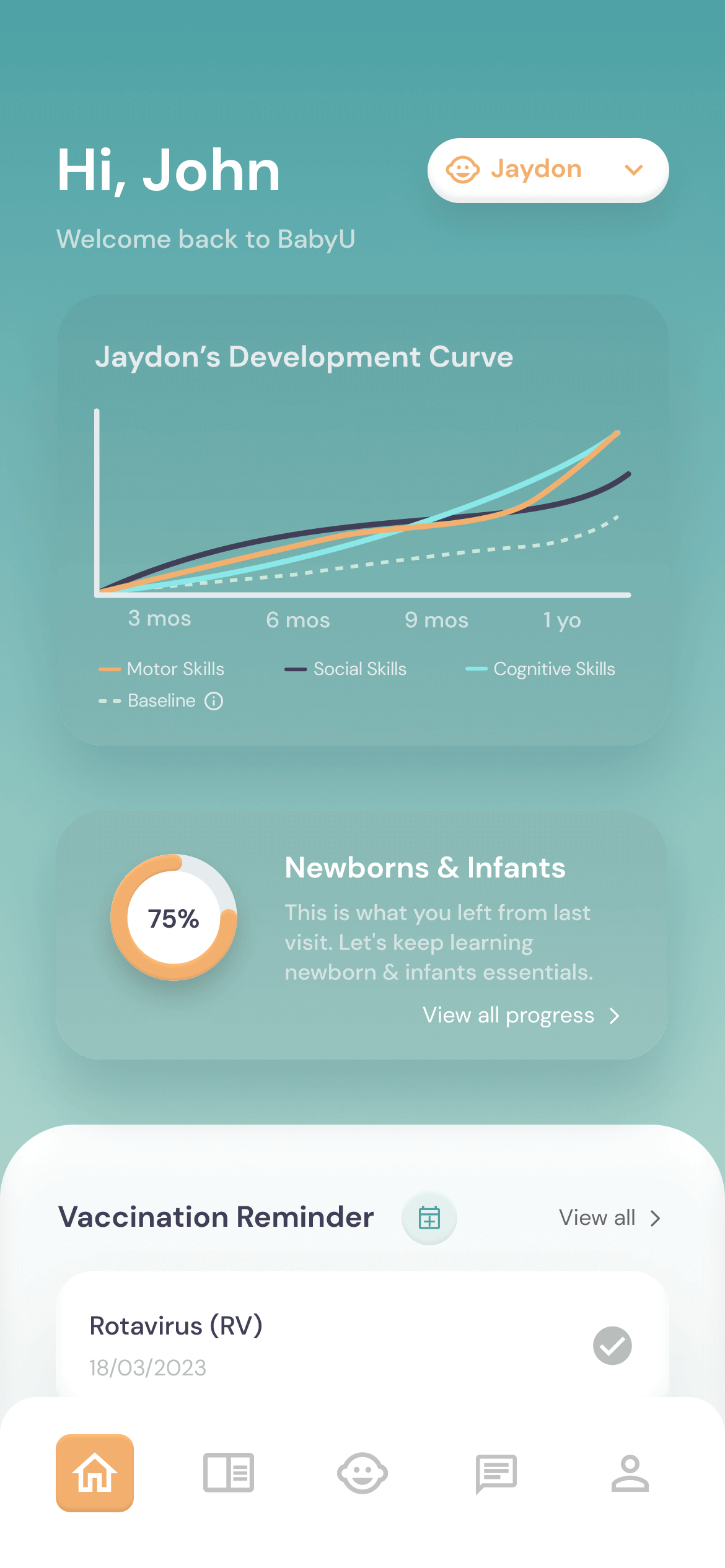
BabyU.

BabyU app info
ROLE
UX Researcher | UX/UI Designer
INSTITUTION
University of Waterloo
PROJECT TYPE
Group Project - Group of 5
TIMEFRAME
1 Month

TOOLS

CONTRIBUTIONS

  • πŸ’‘ Sketched out and refined the usability test script
  • πŸ’‘ Conducted two usability tests
  • πŸ’‘ Worked on mid-fidelity prototype iteration with one other team members
  • πŸ’‘ Independently redesigned UI and improved features and usability of the app
About BabyU πŸ‘Ά
UX/UI design

Raising children is a big deal for parents. First-time parents are often looking for all the information they need to make sure their children can grow up healthy. However, children of different ages have different needs, and the complex needs often make parents sometimes unaware of the needs of children at each stage of development. BabyU is a mobile app that provides baby development tools and resources made easier for first-time parents to facilitate, to monitor, and to keep track of. With BabyU, parents can conveniently check their child's physical and mental development in real time and identify what they need.

What are the problems with first-time parents?

First-time parents do not realize the critical importance of baby's physical and mental development in the first months and years. While they do value basic indicators such as weight, height and diet, they may overlook the different skills children need to exercise to ensure full development. With this in mind, we defined our goal as:

How might we provide a mobile product that enhances the experience of a first-time parent's baby's health development with resources that reflect, support, and encourage their baby's developmental needs?

Current market.

Two of the top grossing parenting apps in the US Google Play Store are Kinedu and BabySparks. The global brand BabyCentre offers a parenting guide that has been installed over 10 million times whereas the official website content reaches about 100 million individuals each month.

Kinedu logo
Kinedu

  • πŸ‘‰πŸ» Baby Development Plan
  • πŸ‘‰πŸ» 5M+ Downloads

Baby Sparks logo
BabySparks

  • πŸ‘‰πŸ» Development Activities & Milestones
  • πŸ‘‰πŸ» 1M+ Downloads

$1.9 billion

is the estimated value of parent coaching industry in 2019

94%

of women use the Internet to find pregnancy details that are generally offered by health specialists

9 - 21%

of women experience depression and/or anxiety at the transition to parenthood period

Pain points.

resource
Finding resources that match their baby's level of development

baby
Baby physical growth tracking does not reflect their development momentum

vaccine
Worry over vaccination safety and the ability to keep track of their baby's vaccinations records

social networking app
Lack of informal social networking mobile apps for parental emotional support and development

Overall, many reviews claim that it is hard for them to connect with the rigid statistics or development structures set up for them. They say the apps often make them believe their child is not on track with their development when really all children have different momentums growing up. Additionally, many parents ask about specific problems that are not addressed in the video tutorials.

User persona.

Jane is a first-time parent who needs to find and track baby development activities and milestones because it helps her understand her 2-months baby's growth development.

persona

Ideate.

We then ideated features and sketched out the wireframe using InVision, the major functions are:

  • Sign-up Page
  • Exercise for baby
  • Activity Tracking
  • Profile
  • Social
  • Vaccinations
wireframe

Mid-fidelity prototype.

Our first version of mid-fidelity prototype contains 5 primary features.

01 Onboarding

Register an account by entering email address, password, parents' info, and child's info

02 Parents Academy

Learn about the parenting knowledge of children at different stages

03 Development Milestones

Check the child's skill development and the corresponding exercises

04 Exercises

Daily or weekly exercise that ensuring the healthy development of children

05 Vaccination Record

Intelligent recommendation of uncompleted vaccines and provide records of completion status and dates

Usability test.

We had two rounds of one-on-one usability test with 5 participants in total. The tests were conducted remotely via Zoom. We tested on five scenarios that cover the primary features listed in the last section, and the participants were asked to perform think aloud protocol. After the testing session, they received 7 questions about their experience and a SUS questionnaire to fill out.

Research Questions

confused person

Do users get stuck while using the app?

missing puzzle

Do users feel that any feature is missing from the app?

uninstall

For what reason(s) would users stop using the app?

Participant Profile

four people

First-time parent with one child * 4

1 person

Experienced parent with two children * 1

User Scenarios

Scenario 1 (onboarding): An expert recommends an app to help you learn how to be a first-time parent. You download it without checking the details. You want to learn more about the app and sign up for an account. You download it without checking the details. You want to learn more about the app and sign up for an account.

Scenario 2 (parents academy): You have a 2-months-old baby. This is your first time raising a baby, and you want to resume your learning for being a first-time parent for your baby's age group.

Scenario 3 (development milestones): Your doctor told you that giving your baby workouts is necessary for the development of their growth, mentally and physically. You have been monitoring your child's development through the application. You want to check the status of your baby's development to see if they are performing well in all aspects. However, if not, you are to attempt to complete the related exercise.

Scenario 4 (exercises): Your doctor told you that giving your baby regular exercise is necessary for physical development. You want to learn how to do the basic exercise.

Scenario 5 (vaccination): You understand that vaccination is important to protect your child's health. You have recently taken your child to receive a vaccine named Rotavirus, and you want to make a record in the app.

Post-task Interview Questions

  1. What is your overall impression to app?
  2. What did you like most about the app?
  3. What did you like the least?
  4. Was there anything that surprised or frustrated you?
  5. What reasons would bring you to continue or stop you from using this app?
  6. Is there anything you feel is missing in this app?
  7. Do you have other final comments?
Q1: Do users get stuck while using the app? πŸ‘‡πŸ»
01
Poor interaction design for clickable tabs

User action: They got stuck after landing on the Fine Motor Skills page

"I thought they are only checkboxes that I can check and uncheck them."

"I didn't realize those are clickable and bring me to a more informative page."

Action: Add an arrow indicating clickability; Make the styles and colors of status indicators consistent over different sections

change1
02
Low discoverability of sections that require user attention

User action: They failed to notice their child's fine motor needs improvement. Instead, they were blindly exploring the app.

"I think my child is performing well."

Action: Highlight "Needs improvement" in red

change2
Q2: Do users feel that any feature is missing from the app? πŸ‘‡πŸ»
01
Lack of options for communicating with an expert and asking questions

"Here (social page) it might be cool to have some supervisors that if you have some questions, you can just ask them."

Action: Add an option to start conversation with an expert for consulting purpose in the chat

change1
02
A need of recommended learning resources for children

"Maybe you can put stuff saying that what kind of books they can read now? Are there any resources? And I can just click the link and buy it right away."

"For parents working at home and kids are at home and doing online school, if there are any resources that are already in this app, that would be super useful."

Action: Added a tab for selecting Courses and Resources

change2
03
A need of setting up notifications or adding the event to the calendar to remind vaccination due dates

"All parents I know are super busy. Vaccination reminder is a very useful thing. If there is a chance or function that you can add to a calendar, that would be super helpful, because I don't have to go to my calendar and do the extra stuff."

Action: Provide an option to add a vaccination event to calendar in the homepage and vaccination record page

change3
04
No day-to-day activity log of completed exercises or courses

"What frustrated me is that I am not able to see if anything is logged."

"Is there a logging of completed exercises?"

* Changes needed in the next step

change4
05
The app only provides records of mandatory or recommended vaccinations and optional vaccination records are not supported

"But what if I have other vaccinations like additional vaccinations? Is there a way to add something that is not in the list? Because there are vaccinations that are recommended and optional ones. I might like to give them more vaccinations."

* Allow adding optional vaccine and the change is implemented in UI redesign

change5
Q3: For what reasons would users stop using the app? πŸ‘‡πŸ»
01
Users may not want to consume information through lengthy courses and will want an option to look at written resources

"I don't want to go through an entire course. I may want to know how to deal with a particular situation immediately and not have to go through a course to find it. If content isn't easy to find I would look at other ways to find info"

Action: Added a tab for selecting Courses and Resources

change1
02
Parents don't want to see information that isn't directly relating to their child.

"When I'm using this app, I don't care about 2 year olds, 3 year olds etc. I want it to be laser focused on my child's age and I want everything I'm seeing based around my kid."

* Add "locked" features and the change is implemented in UI redesign

change2
Recommendation πŸ‘‡πŸ»
Finding Consequence Confidence Next Step
No day-to-day activity log Users don't have the ability to log details of exercises An activity log gives parents a journaling option Provide a logging feature
Cannot record optional vaccinations Users will rely on other methods to record vaccinations Provide a thorough vaccine tracking experience Implement an "add vaccine" feature (completed in UI redesign)
The way in which we visually display the child's development progress needs to be handled with more sensitivity Users may develop negative emotions toward the app Further investigate how parents would like to view their child's progress Conduct A/B testing with more participants on the development curve feature and incorporate widgets
Parents don't want to see information that isn't directly relating to their child Users find the app forcing unnecessary information on to them and stop using the app The app should feel like it is focusing on the user's child completely Enable "locked" features for modules (completed in UI redesign)
Homepage is visually dull and not "welcoming" Users won't be excited to use the app Utilize visual design to create a more delightful experience Implement a design system. Make charts more appealing (completed in UI redesign)

UI redesign.

The project is "finished" after conducting the usability test. However, I feel that there are a lot of improvement opportunties in terms of UI design. Therefore, I independently redesigned the UI and at the same time finished some previously unimplemented changes based on insights from usability testing.

After After
Before Before
Why redesign? πŸ‘‡πŸ»
01 Visually Dull UI

The original UI had only one main color, and most of the screen was grayscale color, which made the interface very dull and monotonous. To make it more welcoming and baby-ish, I implemented neumorphism style by adding drop shadow and inner shadow to the elements. Moreover, I added more colors to the interfaces and redesigned the primary and secondary colors.

02 Poor Accessability

The original primary color is #8FFF00 with black text on it. The bright green is not very friendly to the user's vision and thus cannot pass the accessibility. Instead, I used a more saturated color #4EA1A5 with white text and #E6ECEE with dark blue texts as the primary colors, which take up 90% of the screens. I chose #F2B06D as the secondary color and make it occupy the remaining 10%.

What added/changed? πŸ‘‡πŸ»
Next steps from usability tests
  • Implemented an "add vaccine" feature
  • Enabled "locked" features for modules
  • Implemented a design system and make charts more appealing
Other changes made
  • Redesigned the onboarding flow
  • Redesigned the homepage
  • Refined the "add to calendar" feature of vaccination record
  • Enabled filtering for courses in the parent academy
01
Implemented an "add vaccine" feature
  • - Allowed adding optional vaccine to the record
  • - Enabled adding the reminder to external calendar when a new vaccine is added
  • - A prompt to indicate the successful operation
02
Enabled "locked" features for modules
  • - Locked modules when child has not reach the stage
  • - Enabled manual unlocking of modules when child is performing advance
03
Redesigned the onboarding flow
  • - Reorganized the welcoming page layout
  • - Divided the information registeration flow into three steps/screens
  • - Added illustrations
  • - Used tabs to divide multiple children info input fields
04
Redesigned the homepage
  • - Redesigned the UI elements
  • - Kept the parent academy learning progress at the time of the last visit to avoid confusion
  • - Unified vaccination reminder design with its detail page
  • - Enabled multiple children switching on the homepage
05
Refined the "add to calendar" feature of vaccination record
  • - Unified the design of "add to calendar" feature on the homepage and vaccine details page
06
Enabled filtering for courses in the parent academy
  • - Allowed to filtering by "All", "Ongoing", and "Completed" courses

Colors & typography.

color scheme
typography

High-fidelity prototype.

Click here to experience the work.

Parent academy.

  1. πŸ’‘ Provide video and text parenting instructions as well as book and website resources for children at different stages. The selection will affect the content delivered to the kids.
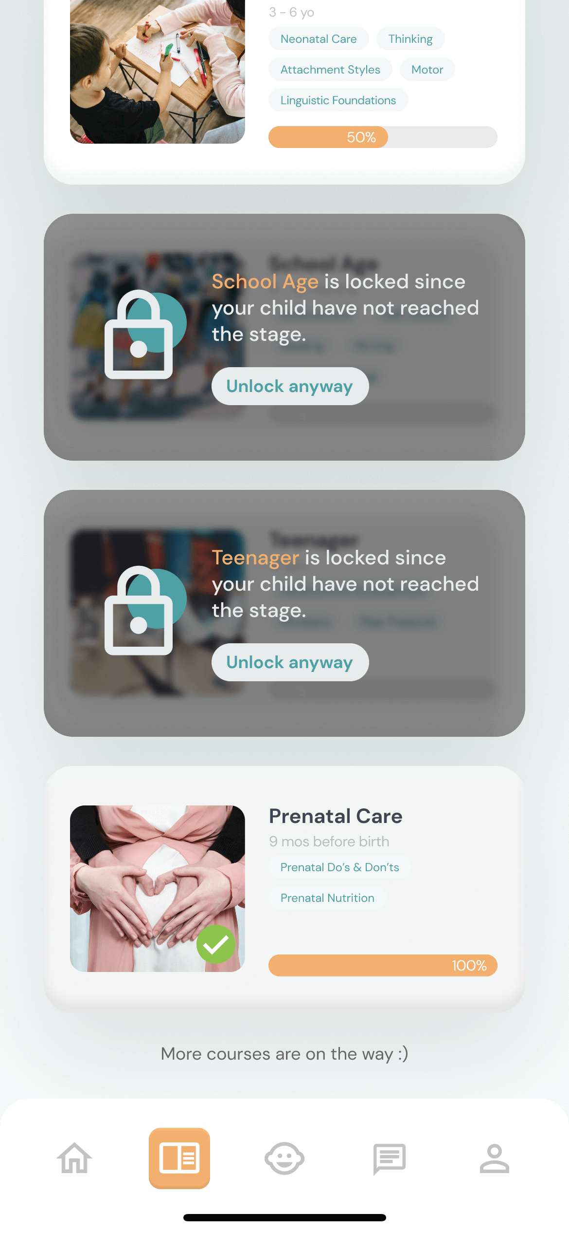
  2. πŸ’‘ By default, the module corresponding to the stage where the child does not reach the stage is locked while mamual unlock is supported.
  3. πŸ’‘ Allow filtering the modules by "All", "Ongoing", and "Completed".

Development milestone.

  1. πŸ’‘ Check child's development including motor skills, cognitive skills, and social skills.
  2. πŸ’‘ Intelligent recommendation of a series of training courses for development.
  3. πŸ’‘ Weak aspects are marked as "Needs improvement" in red for attention

Exercises & skills.

  1. πŸ’‘ Video-based courses for general exercises and skills development.
  2. πŸ’‘ A list of tasks in the instruction page for a quick overview

Vaccination record.

  1. πŸ’‘ List of mandatory vaccines recommended according to the age of the child.
  2. πŸ’‘ Make a record of completed vaccinations
  3. πŸ’‘ Add the vaccination reminder to external calendar.
  4. πŸ’‘ Allow adding an optional vaccination and its due date.

Takeaways.

Impacts πŸ‘‡πŸ»

During our user testing, parents mentioned that they would have loved to have an app like this when they were starting off as first time parents.

What We Learned πŸ‘‡πŸ»
  • Improved time management skills by organizing project timeline details early into the project while taking into account member timezone and workload differences
  • Expanded knowledge of the UX design process and user research skills through the facilitation of usability testing sessions.

Next steps.

  1. Conduct further test since some features proved to be ambiguous with our 5 participants. (i.e. There were mixed opinions on the visual graphs used to display child development).
  2. Implement more features such as activity log.
  3. Apply widgets to homepage design elements so that users can customize the content displayed on the homepage.

πŸ‘€ Random projects.

🎲 Shuffle